20 projects across UX, Web Design, and Product Design
Interactive travel booking portal — flights, hotels & cars in one session
Blockchain payment protocol — futuristic, matrix-inspired web design

Search & booking site for neighbourhood walking tours

A fair digital marketplace for Indian farmers — buy, sell, rent equipment
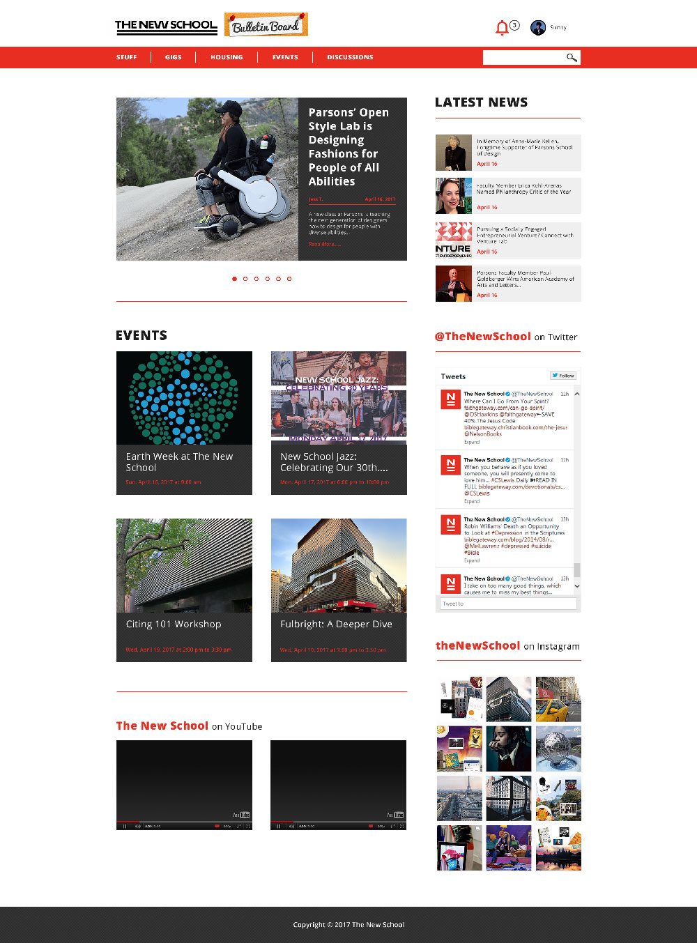
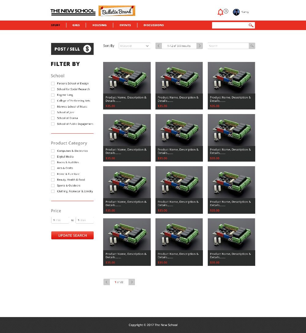
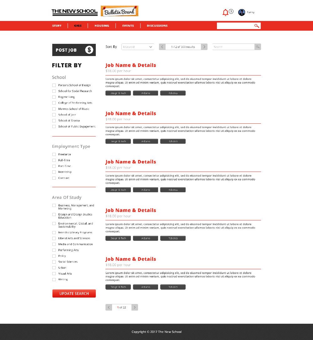
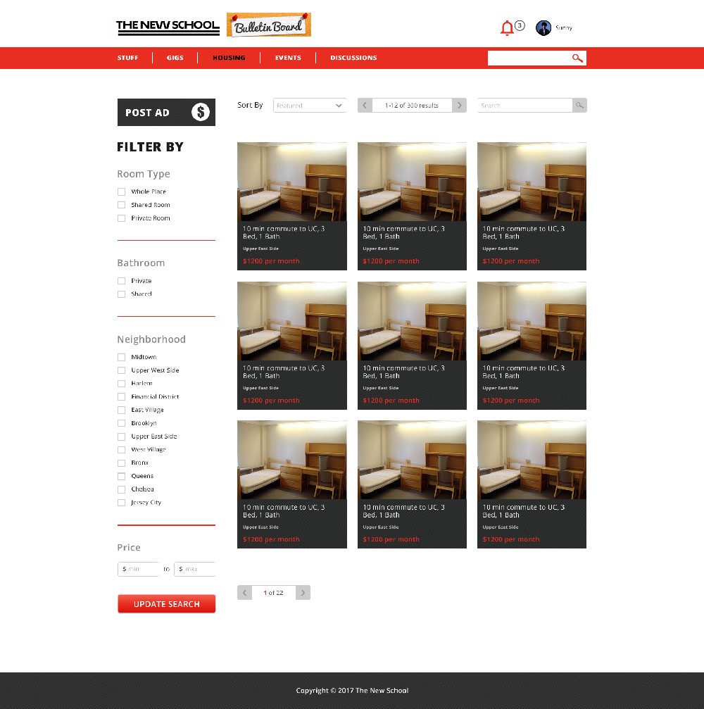
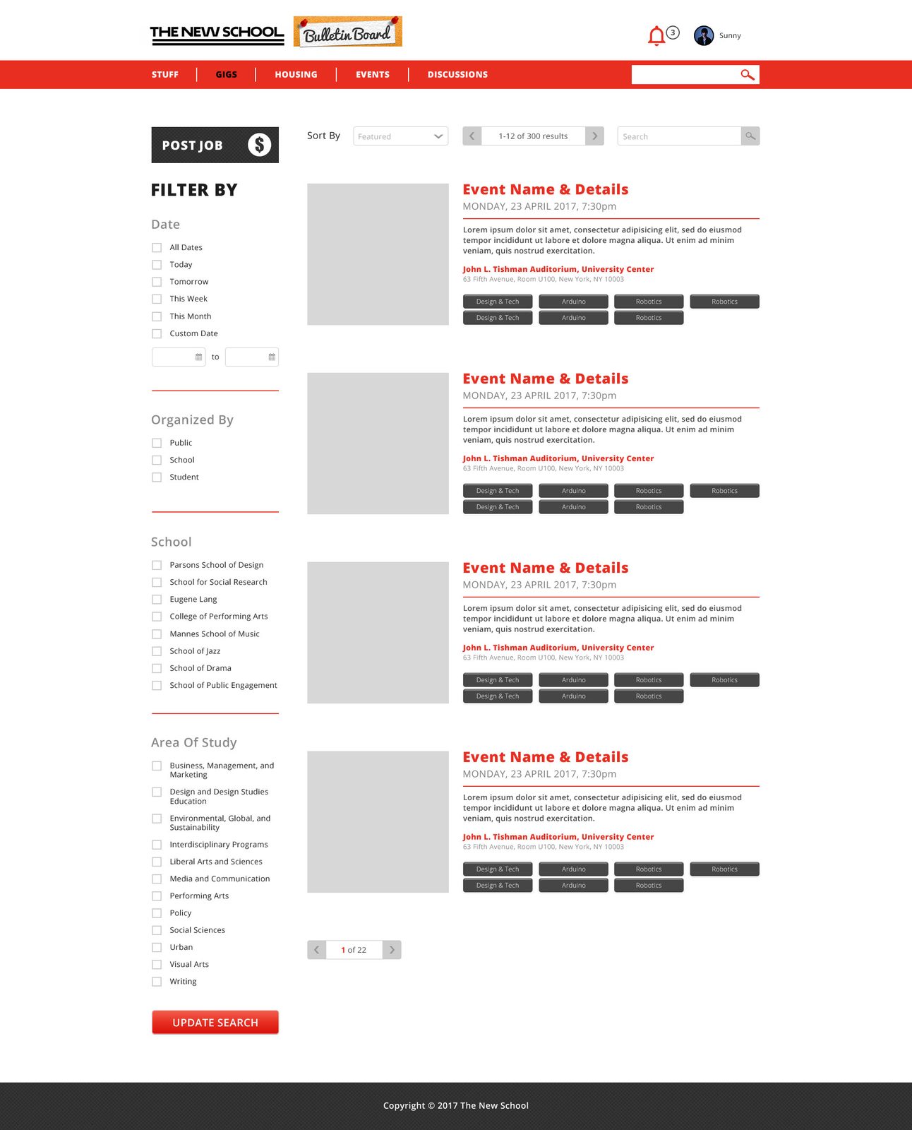
Digital campus marketplace and community portal for The New School

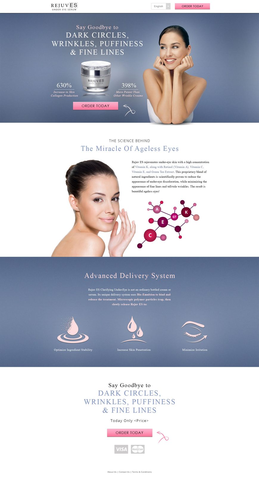
Elegant single-page website for an under-eye serum brand
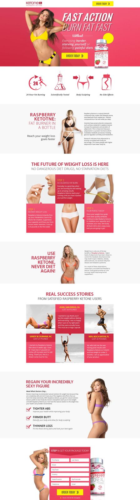
Health product website template for a Raspberry Ketone supplement brand

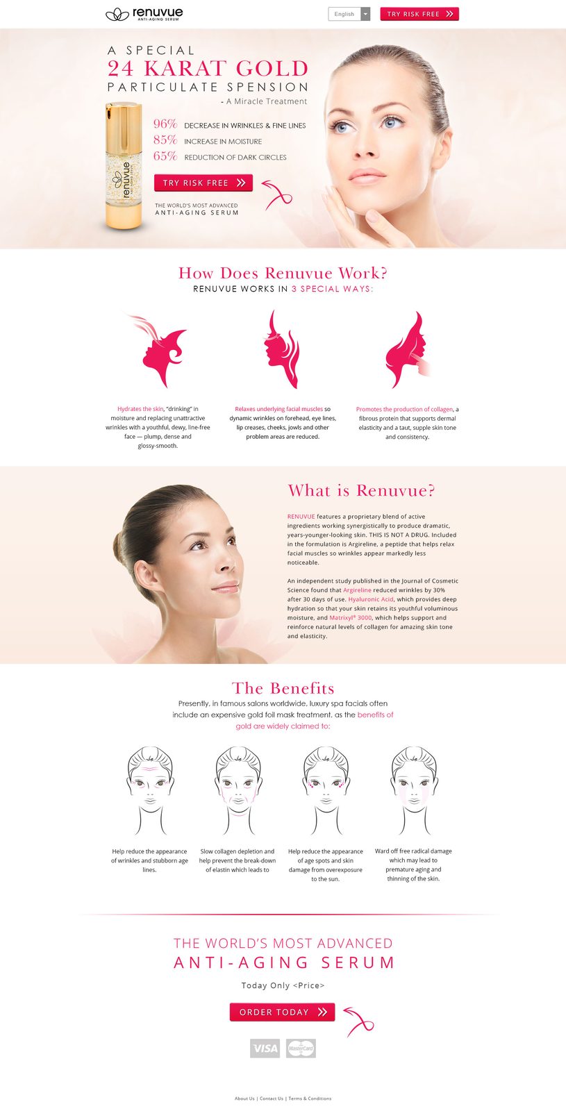
Clean, infographic-led website for an anti-aging serum
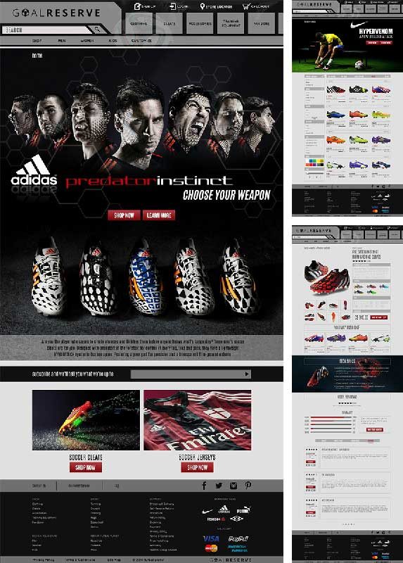
The American soccer fan's one-stop destination for gear and paraphernalia
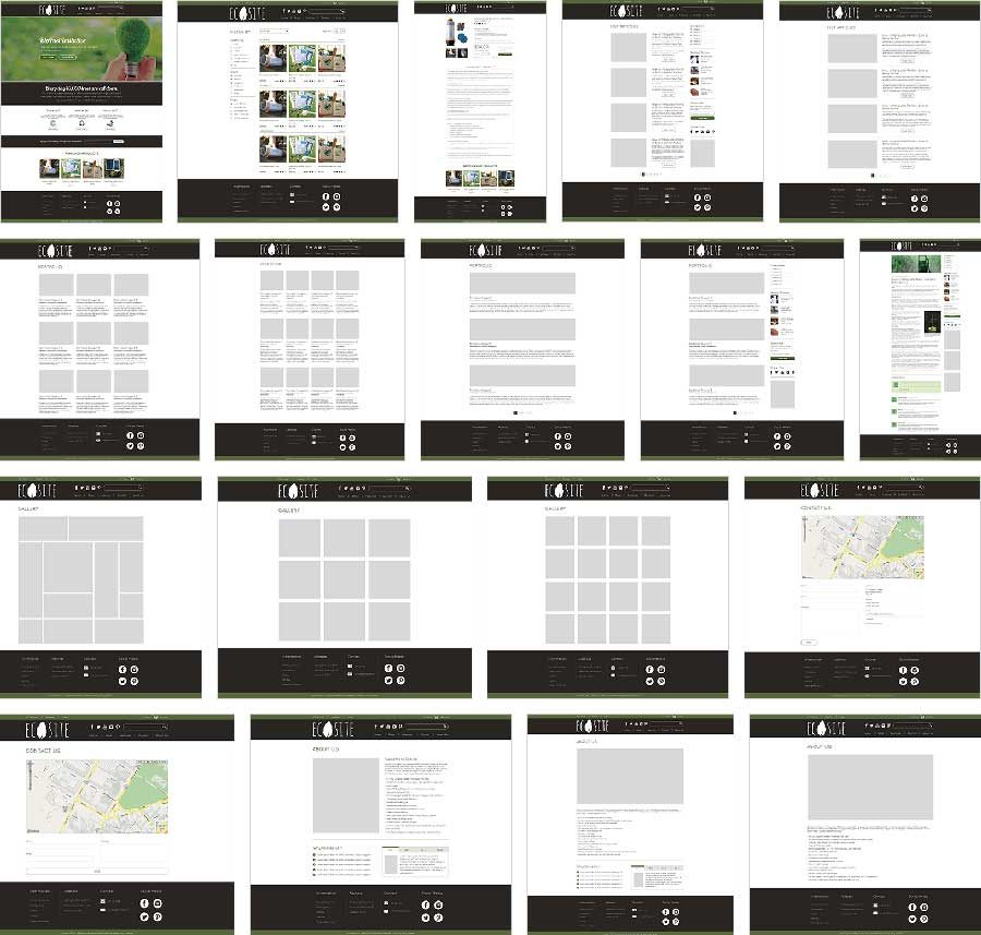
Multi-page PSD template for ecological and environmental businesses

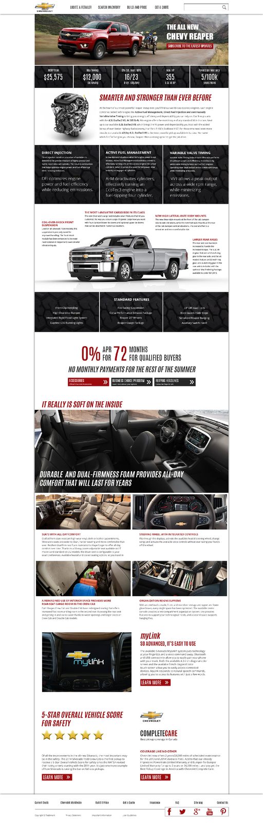
Product showcase page for the Chevrolet Reaper truck

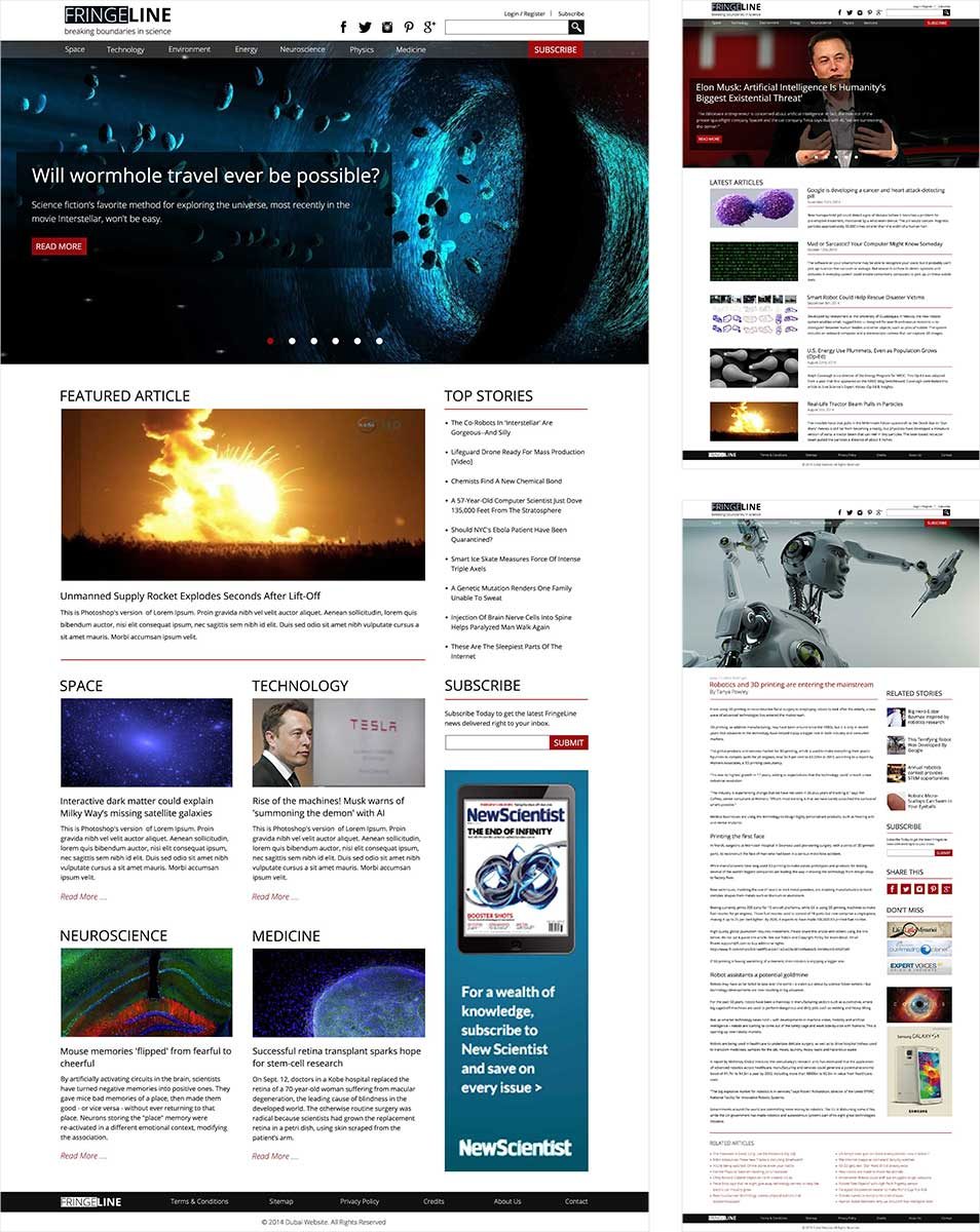
Science and technology blog — breaking boundaries in knowledge sharing
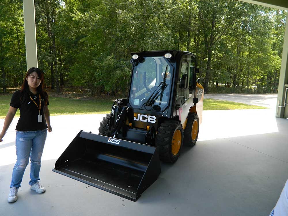
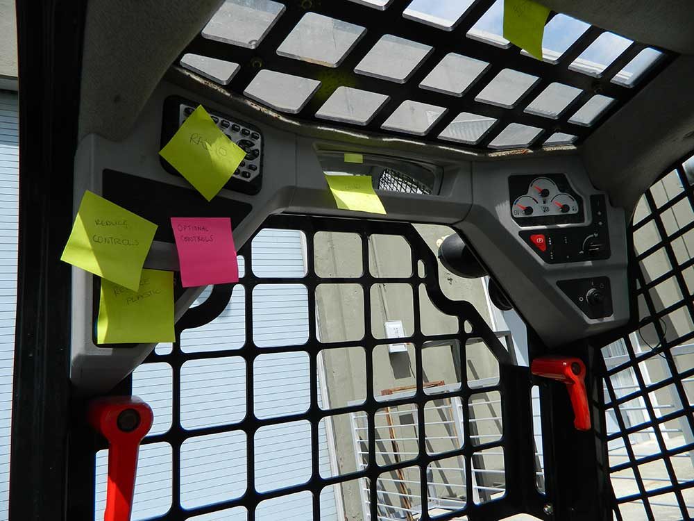
3-generation modular skid steer concept — from immediate to 10+ year future
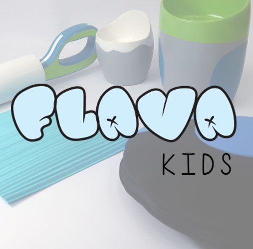
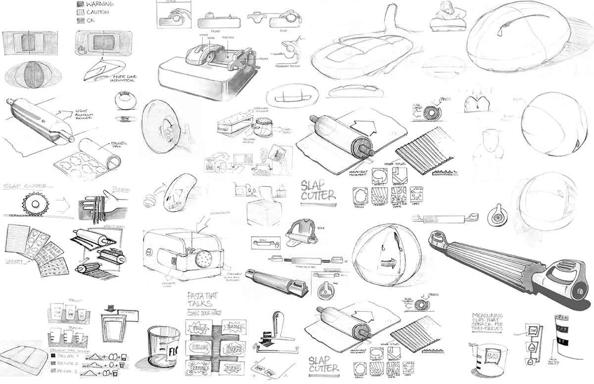
Pasta-making tool set designed for children ages 8–12
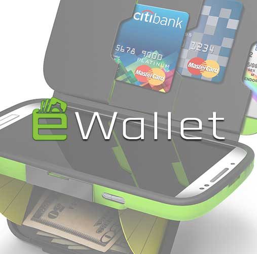
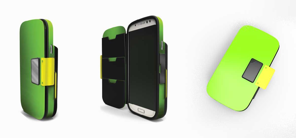
NFC-enabled physical e-wallet concept bridging cash and digital payments

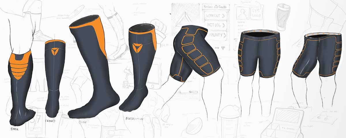
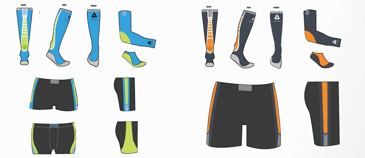
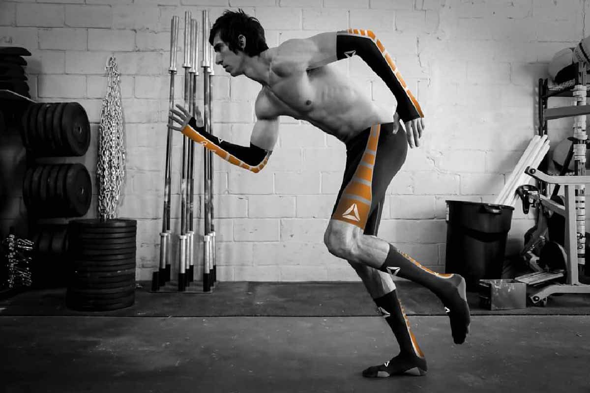
Wearable technology collaboration — performance sensor compression suit
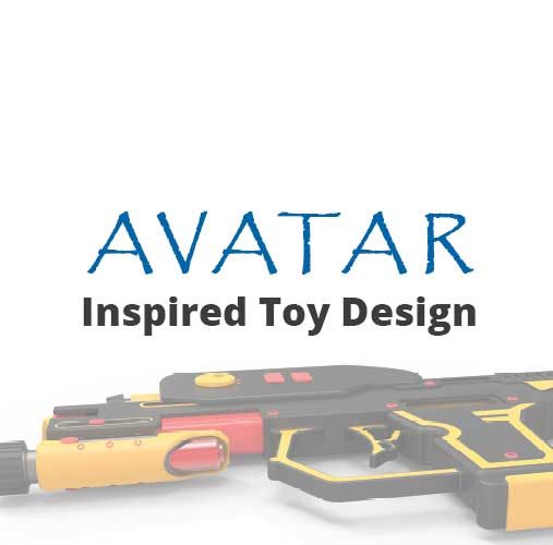
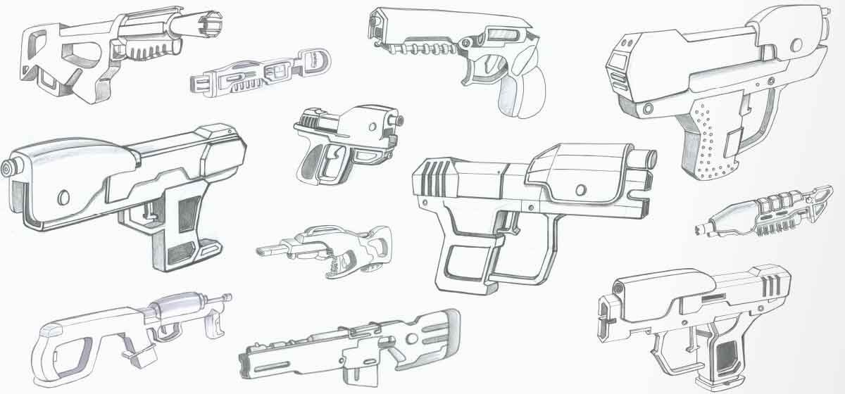
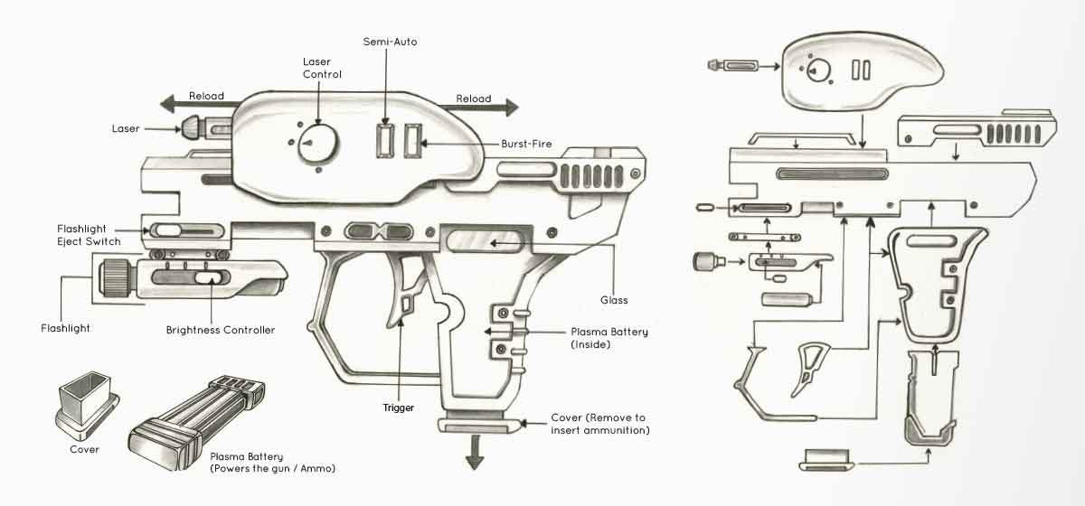
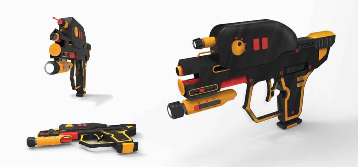
Weapon design for the Avatar franchise — adapted for children ages 8–14

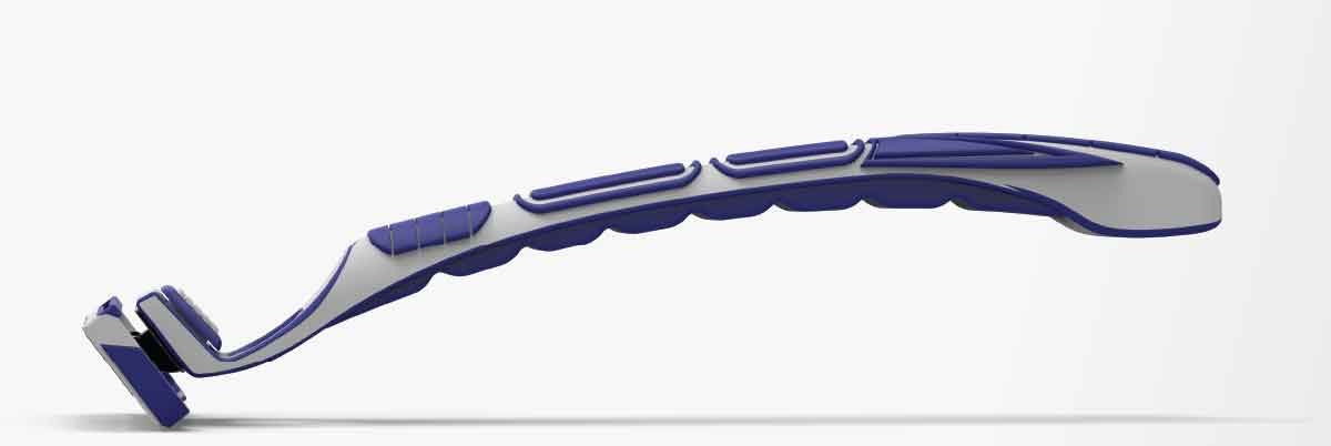
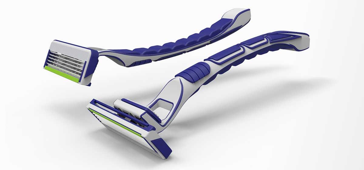
Shaving blade concept combining style, ergonomics, and cost efficiency

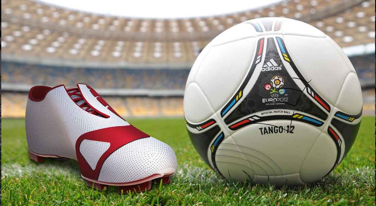
Soccer cleat concept — elegant, classic aesthetic inspired by the 80s & 90s
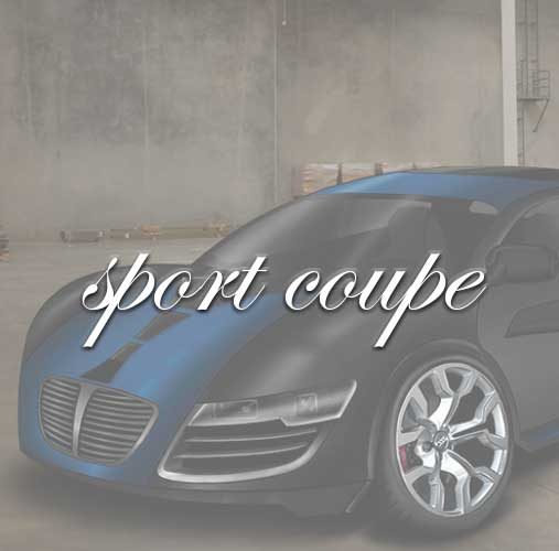
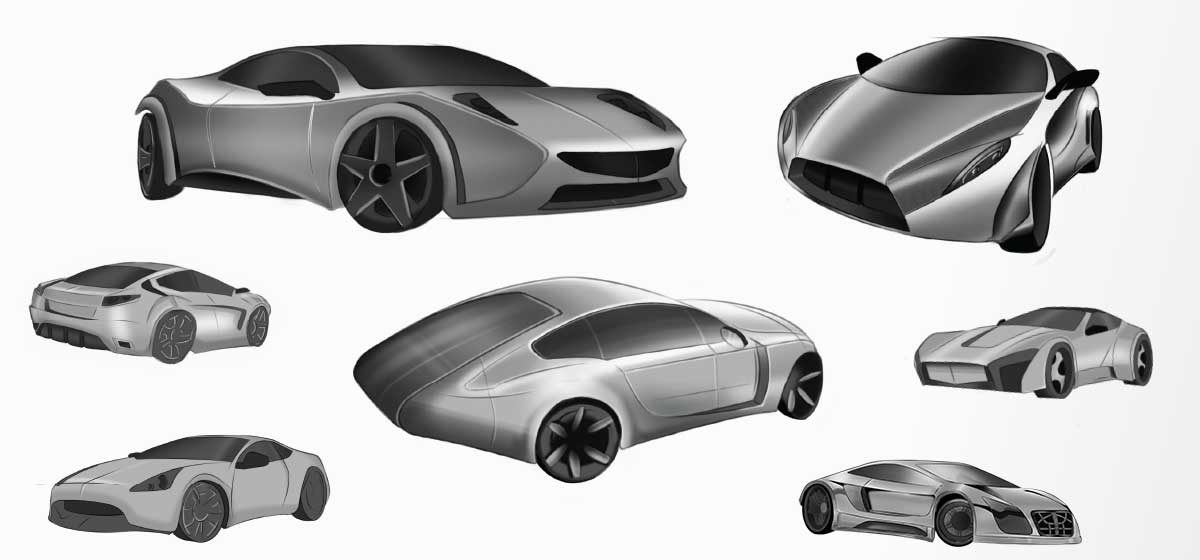
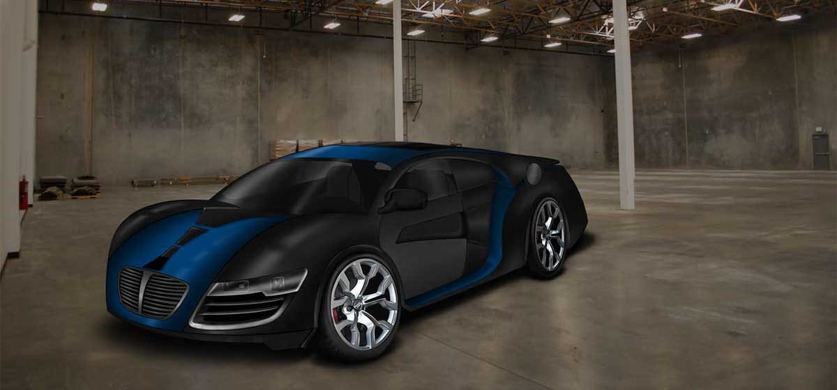
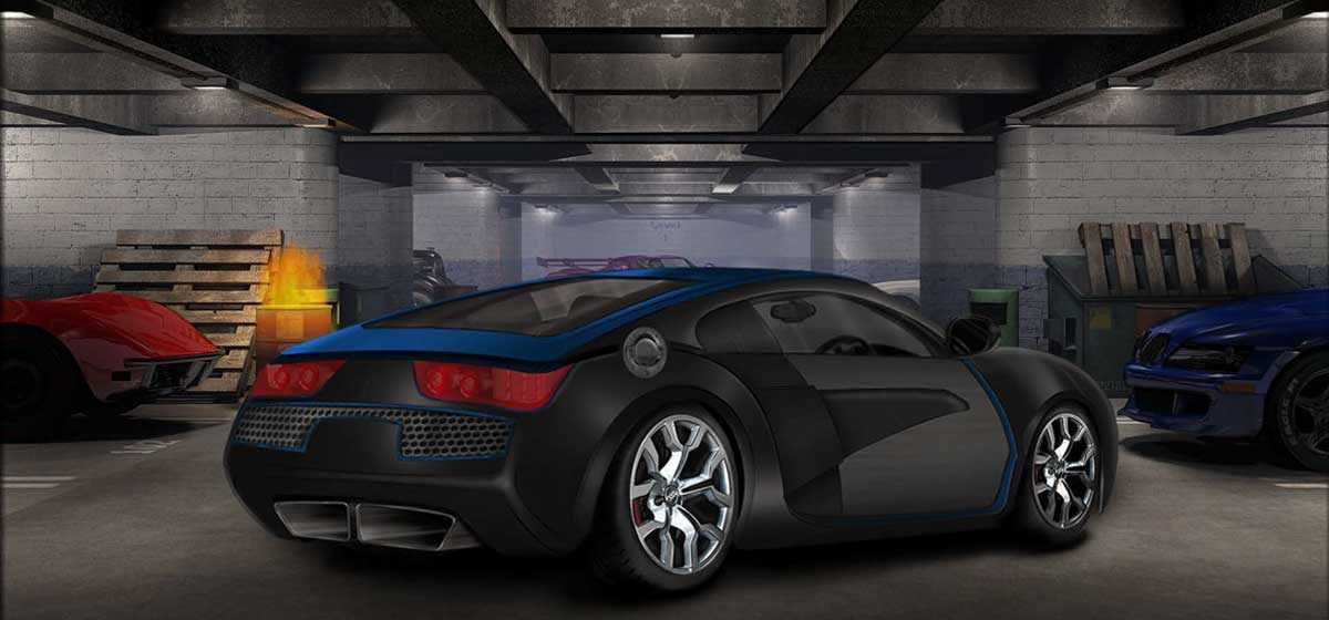
Automotive aesthetic design concept — ideation through final render
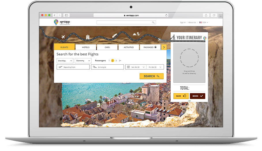
Change the way you Travel
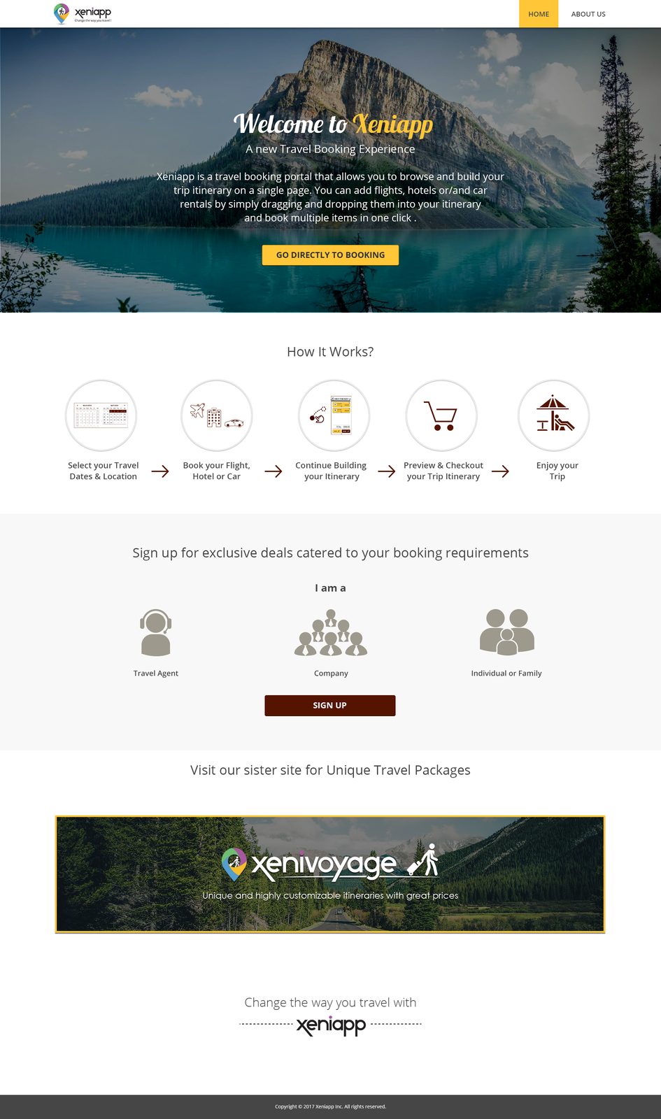
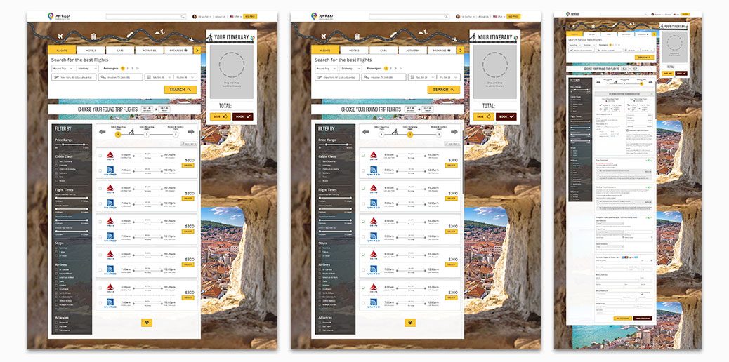
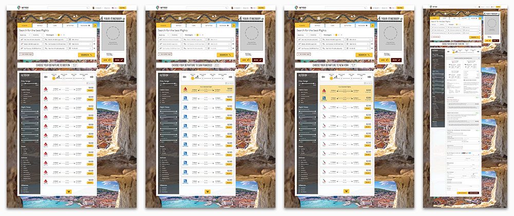
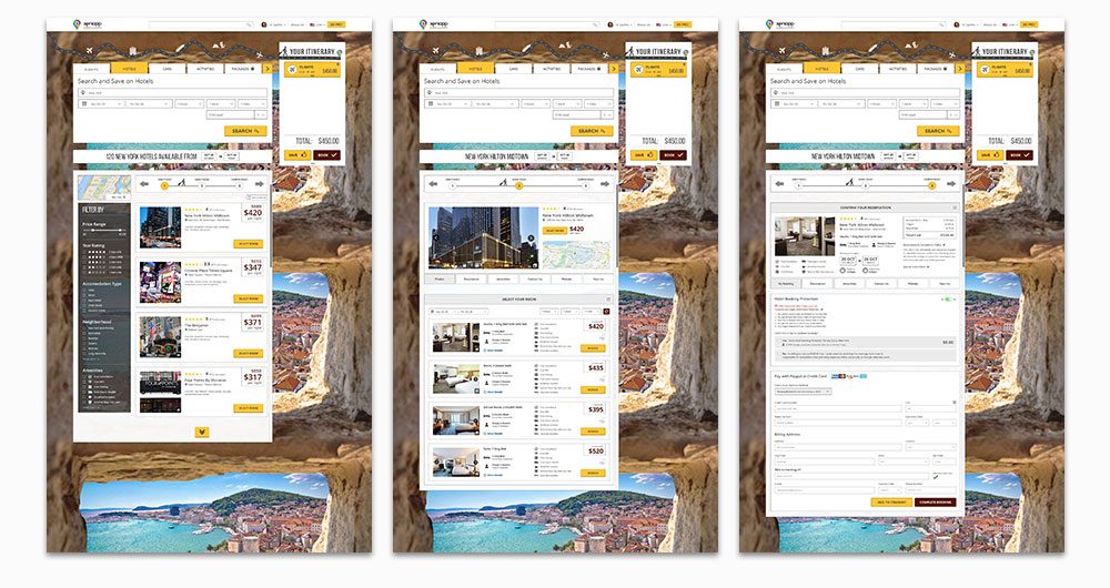
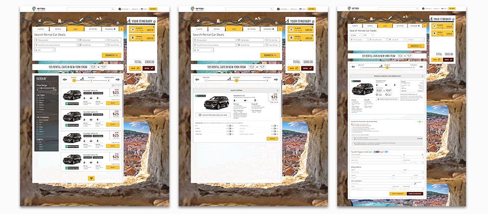
Xeniapp is a travel booking portal that allows you to browse and build your trip itinerary on a single page. You can add flights, hotels or/and car rentals by simply dragging and dropping them into your itinerary and book multiple items in one click.
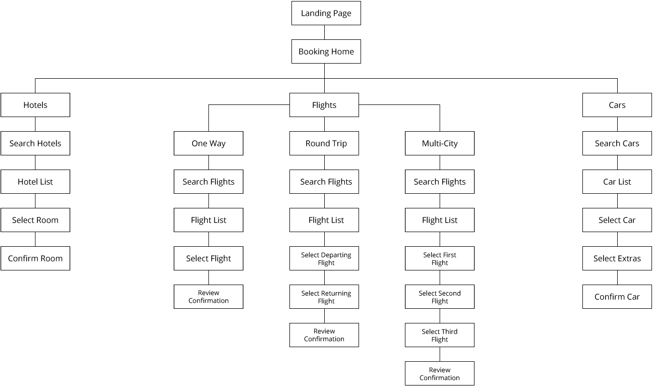
As product designer, I was tasked with designing the travel portal and all that came with it. I was responsible for establishing the Website's structure, user-experience and aesthetic. The CEO had a very specific vision for the product, and it was my job to bring that vision to fruition, which include coordinating with the Development team to ensure the designs were implemented as intended.
Travel Booking has evolved in recent years. People are increasingly opting to make all their purchases on a single portal due to convenience and potential savings (on package-deals). This led us to ask the question,
How can we provide a seamless interactive booking experience for curated travel-packages?
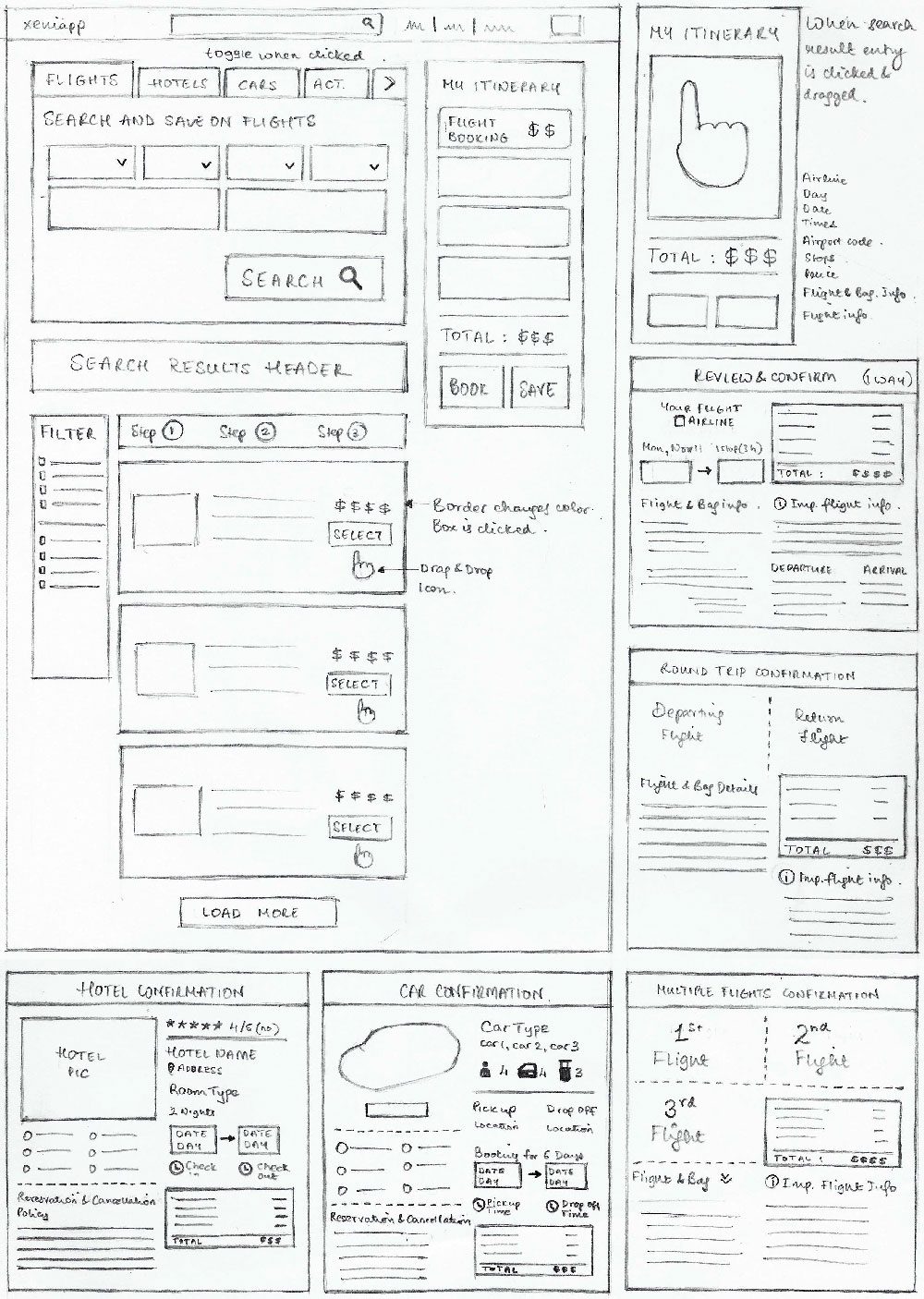
Xeniapp intends to be the world's first interactive travel booking experience, where the user would be able to book an entire travel itinerary (hotels, cars, flights, activities) without having to leave the page (i.e. in the same session). This gives the user a real-time view of the cost of their final travel-package.
Given the new user experience of the website, a landing page explaining how the website works was absolutely essential. The company also had tailor-made experiences for Travel agents and Companies looking to book for a group of people. This page was meant to give these unique customers a very clear starting point to navigate the website.
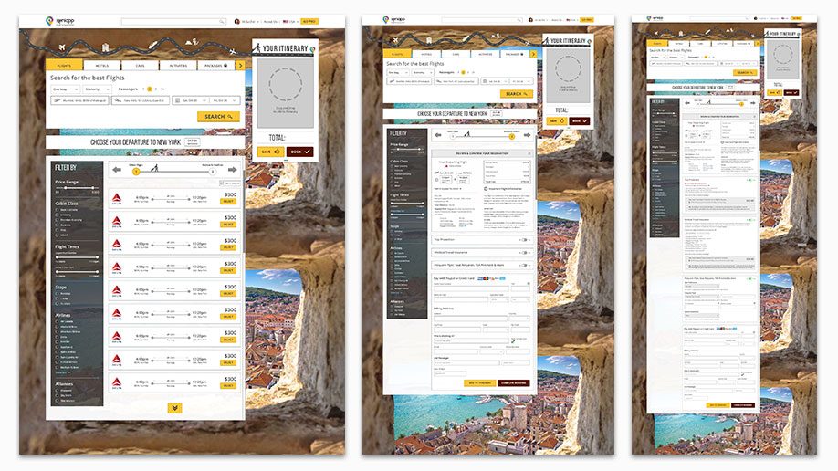
Flight Booking — One Way
Flight Booking — Round Trip
Flight Booking — Multi-City
Hotel Booking
Car Booking
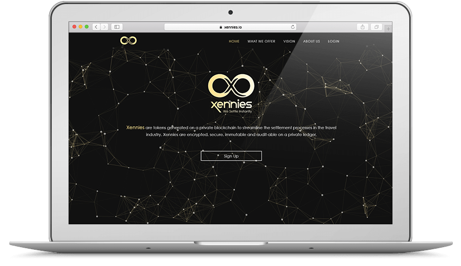
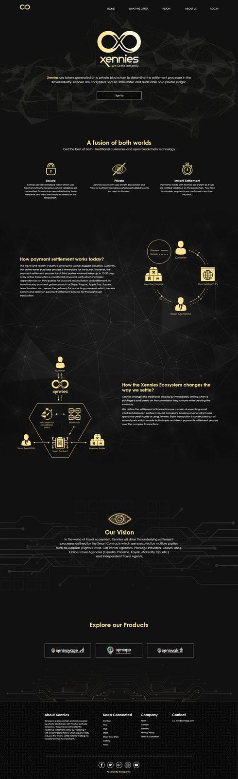
We Settle Instantly
Xennies.io is a blockchain protocol powered by private blockchain with Proof-of-authority consensus. The protocol eliminates the traditional settlement policy by replacing it with decentralized tokens which exponentially reduces the time to settle instantly making it a favorite form for the merchants.
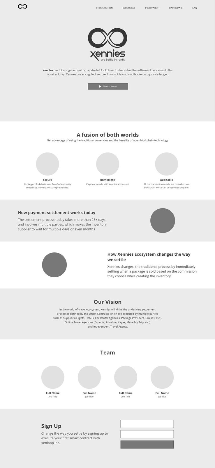
Given the complex nature of the product, I was tasked with designing a website that would best help explain Xennies to the general public. Therefore, it was necessary to keep the structure of the website simple and intuitive.
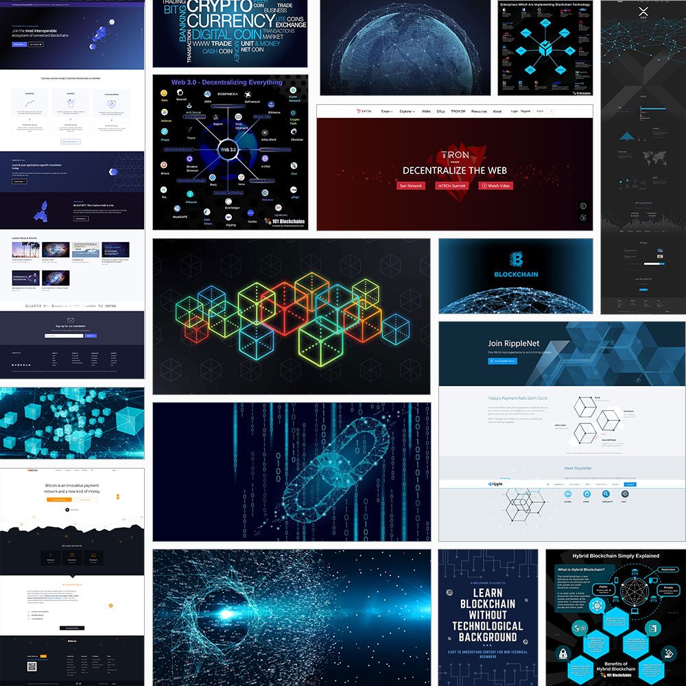
The design of the website however, was meant to reflect the nature of the product. Futuristic, cool, Tech and the Matrix were some of the design keywords thrown my way.
The information presented on the website was key. The goal was to explain what Xennies were and how it worked with Xeniapp's booking engine. I therefore began the design process by first structuring the content on the page, making sure that by the time the user reached the end they had a basic comprehension of what Xennies were.
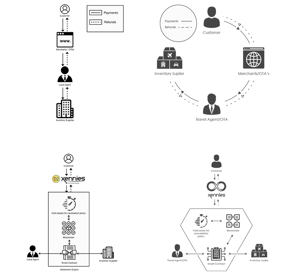
An interesting aspect of the design phase of the project was taking the crude diagrams put together by the blockchain developer and revising them to fit within the design aesthetic of the website, while still maintaining the core meaning of the diagrams. Fortunately, I was able to do just that.
Search & Book Walking Tours
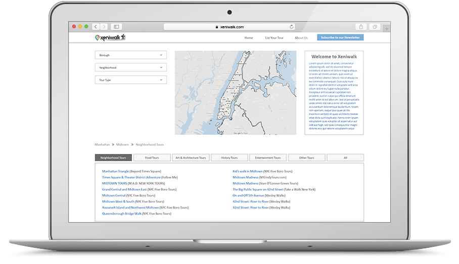
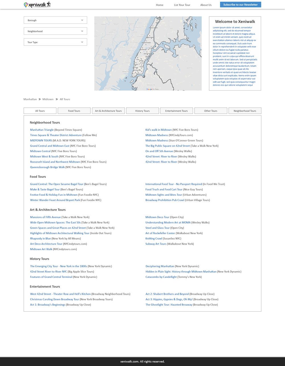
Xeniwalk is a search and booking site for walking tours that provides a comprehensive list of walking tours that are easily searchable by neighborhood and topic. They provide links to tour company websites where tours can be booked.
In an attempt to boost traffic to Xeniapp, the company decided to launch a smaller scale product targeting a related market — Walking Tours. Given that the age demographic of such an activity ranged wide (young adults, families and the elderly), the company decided that a simple database of available walking tours would be the best design strategy given the varying levels of technological prowess within the target demographic. The final design was reflective of that thinking — simple, minimalistic and intuitive.
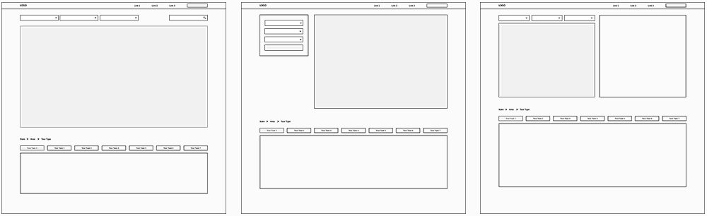
Given the minimalistic design strategy we were employing, structuring the page was rather simple. The main components of the website were the search filter, map and the search results, segmented by tour type. We later decided to add a brief description of the website on the home page itself, in addition to a separate About Us page.
A Fair Market for the Indian Farmer
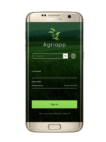
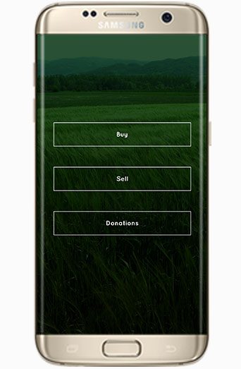
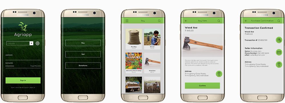
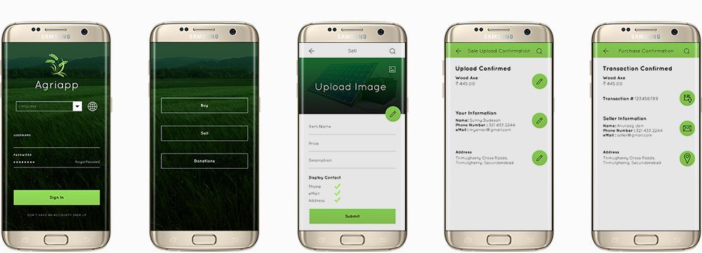
Agriapp is an app for Indian farmers that will help them buy, sell, rent, exchange equipment and to sell produce.
Lower to Middle Income Indian Farmers (Indian Agricultural Sector)
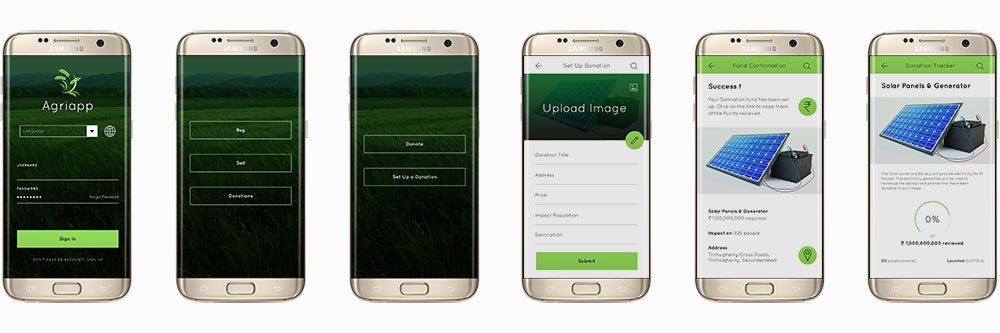
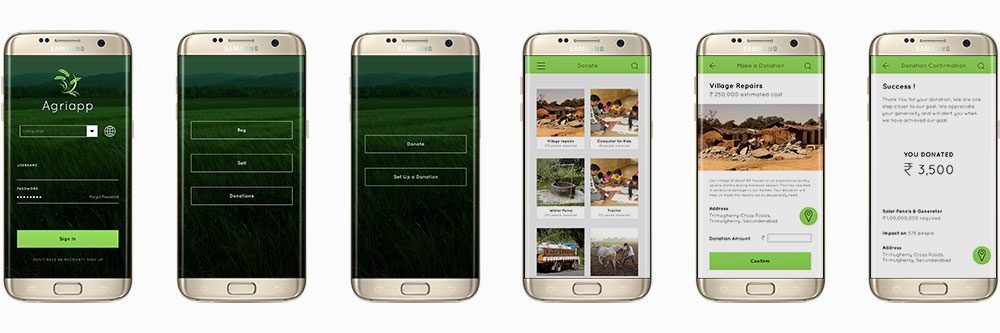
Agriapp is an app for Indian farmers that will help them buy/sell/rent/exchange equipment and to sell produce. This app will assist in establishing regular delivery routes, finding businesses catering to services the farmer may need like storage and labor and in establishing a community of like-minded individuals (within reach) who face common challenges.
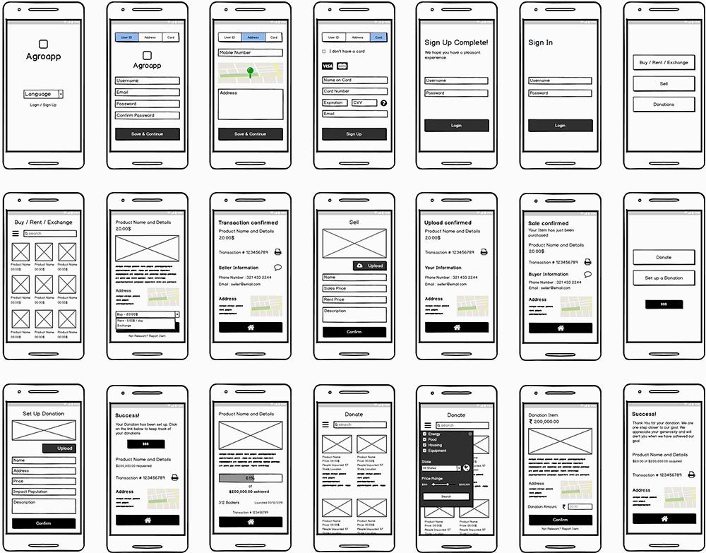
User Scenario 1: Buying An Axe
User Scenario 2: Selling An Axe
User Scenario 3: Setting up a Donation
User Scenario 4: Donate
Bulletin Board
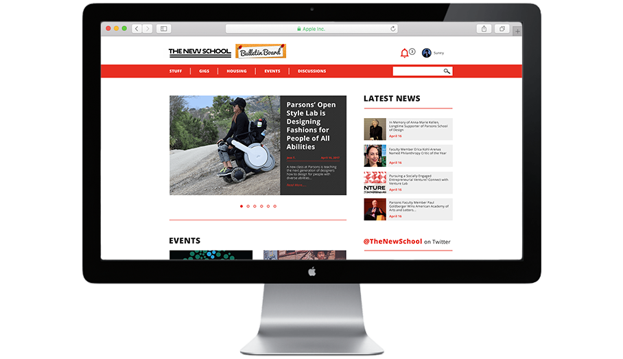
The New School Bulletin Board is an online portal (website) for New School students to sell and purchase goods, providing them an accessible, exclusive, and safe community and marketplace for the opportunity to rid themselves of products they don't need in return for financial gain.
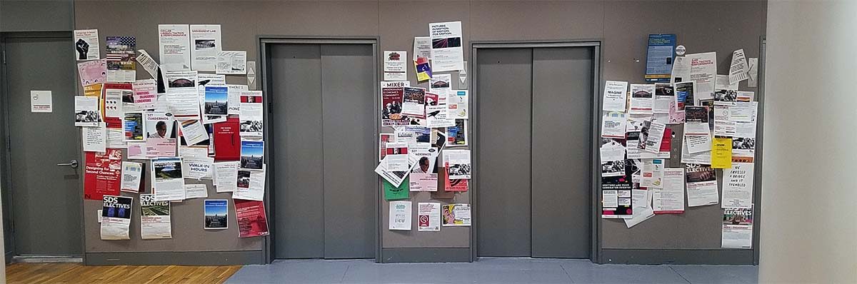
All around the New School Campus, across all buildings there are sights such as the one above. These are its drawbacks:
How can I make the New School Bulletin Boards more efficient and organized to ensure that the needs of the advertiser are being fulfilled faster and more accurately?
A Digital Bulletin board (Website) for New School members (students and staff) that provides a community and marketplace for the exchange of products and services, and a place to advertise events and meetups of any size.
The College student is a unique demographic. College tuition is a burden in of itself but add to that the cost of supplies, food and rent, that burden weighs you down further. This is why students are always on the lookout for second hand supplies and shared accommodation. The current student network systems employed at the New School to assist with such transactions are essentially a pin up board with a clatter of posters and a group mail. The New School Bulletin Board is a website that digitizes that platform adding organization and the ability to stream your searches resulting in increased efficiency and an expanded network.
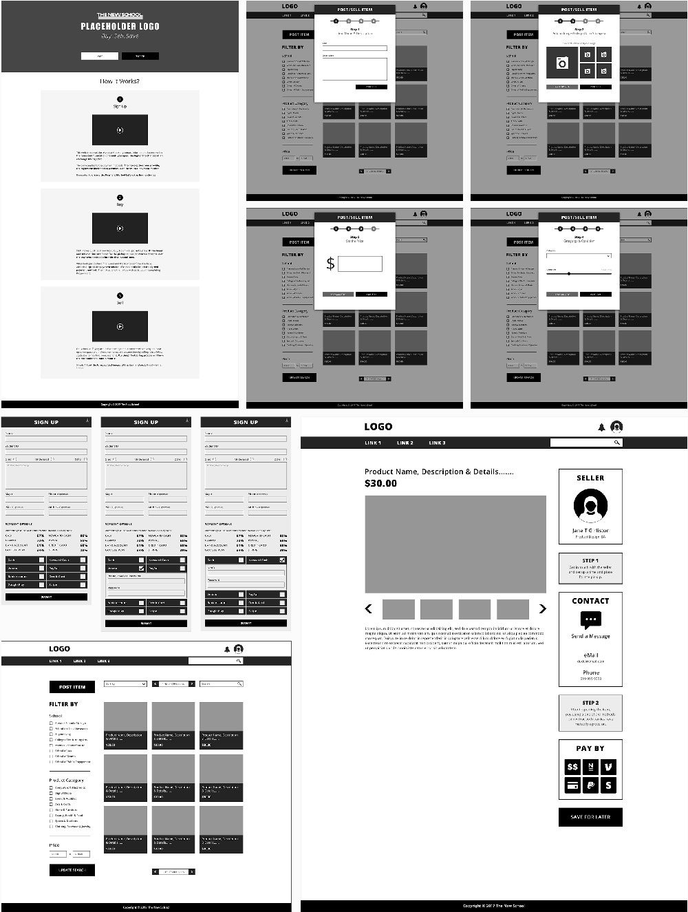
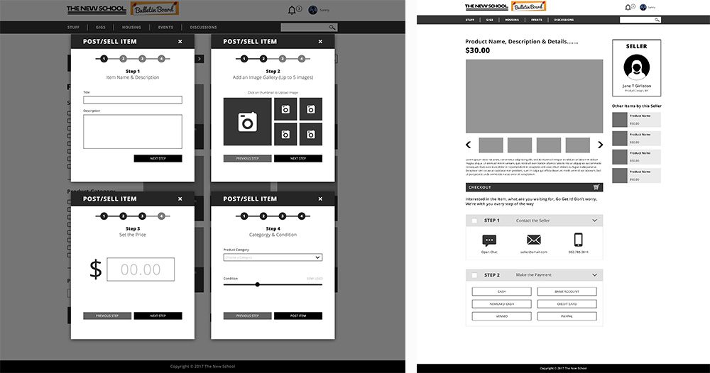
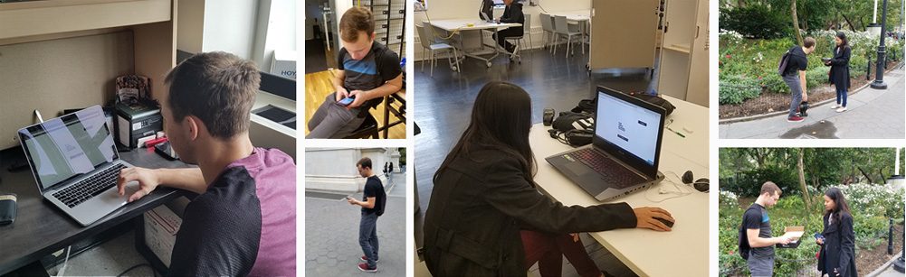
Given the scale of the project and the allotted time constraints, I decided to focus my efforts on one key aspect of the website — the sale and purchase of goods on the website. Using the iterative process, I wireframed and tested 3 iterations of the Product Post and Purchase user flows. I began by clearly framing my focusing questions:
Home Page
The Home Page serves as the front page of the New School, providing a brief glimpse into the various avenues of information. The top section highlights the biggest stories on campus, the Events section highlights the week's featured events and the various social media accounts (Twitter, Instagram and YouTube) offers a glimpse into Campus Life and happenings.
Product Page
The Product Page allows New School Students to sell and purchase goods at a much-reduced cost, essentially providing an accessible yet exclusive, and by extension safe community and marketplace for the opportunity to rid themselves of products they don't need in return for financial gain. This also means a market for students catered to their unique academic and conceptual needs with products that would be rare or expensive elsewhere.
Jobs Page
The Jobs Page gives students an alternative to make money to on-campus job placements. If you are looking to make a quick buck, scroll through the jobs section to find a job suited to your skillset or expertise. This type of system encourages collaboration and interdepartmental cooperation. The other side to the Jobs Page is the fact that it allows students to post jobs themselves. If part of your project requires a skillset or technology you don't possess and you don't personally benefit from learning it, why not compensate someone who does possess that skill for their efforts, saving you time and effort in the process.
Housing Page
The Housing Page is specifically catered to the needs of the average college student. In terms of housing, College Students often find themselves in a demographic of their own. Their needs are so specific that very often the only people willing to be part of such a situation are other like-minded students. For this reason the Housing Page makes sense, students have the ability to customize their living situation. They can choose their room type (studio, private or shared), bathroom situation, location and even set a price range that falls within their budget.
Events Page
The Events Page is for anyone organizing or attending a New School event. If you individually or collectively want to set up an event and control the attendance (school, public or private) of the event, this page is for you. The page also enables users to search for any future event hosted by the New School.
Under Eye Serum
An in-house web template designed during my time working in Vancouver, for an under-eye serum brand. The brief was "Simple Elegance" — a big segment of the company's clientele were health and beauty companies looking to revamp their online presence.
Click to Preview all Pages
Raspberry Ketone Supplement
An in-house web template built for a health product brand during my time in Vancouver. Part of a diverse template library the company maintained to ensure timely delivery of client projects in the health and beauty sector.
Click to Preview all Pages
Anti-Aging Serum
Clean, simple and elegant — focused on the product, its benefits, and infographics. A reflection of the growing trend of using visuals to explain concepts alongside copy. Designed as part of an in-house template library for health and beauty clients.
Click to Preview all Pages
The American Soccer Fan's One-Stop Store
Goalreserve is the American Soccer Fan's one stop destination for all the soccer gear and paraphernalia. The focus of this project was on the visual aesthetic of the website and its user experience. Being that this was one of my first experiences designing a full website, I leaned heavily on precedent to ensure that the key user flow of buying a product remained unchanged (Amazon, eBay etc.). The unique navbar was an attempt to deviate slightly from established design practices to build something I had never seen before.
Click to Preview all Pages
The Premier Eco Theme
Ecosite is a web PSD template designed for individuals or businesses looking to build a clean and intuitive website. It is designed to be thematically suited to any ecological or environmental business or project. Template includes the home, product categories and showcase, article and article list, about, contact, gallery and portfolio pages — all with options regarding columns and additional content.
Click to Preview all Pages
Smarter & Stronger than ever before
A product page for the Chevrolet Reaper truck — designed to sell and educate the viewer about the truck's features. An early project that taught me how to balance visual impact with information hierarchy.
Breaking Boundaries in Science & Technology
A science and technology blog concept — the design foundation for a future business I've always wanted to build. Designed during a diploma program, it gave me creative freedom to explore editorial web design.
Click to Preview all Pages
3-Generation Design Roadmap
A mission to increase JCB's profit margin and market share through value-added smart design — spanning an immediate Generation 1, a 3–5 year Generation 2, and a 10+ year future Generation 3.
To increase JCB's profit margin in their skid steer product line, increase their market share through value added smart design and to gain an understanding of JCB's needs as an equipment manufacturer and how to balance their needs with those of their customers. Furthermore, our mission scope not only encompasses a viable solution for immediate future production, but is an attempt to understand and forecast the future needs and desires of the skid steer customer.
Primary Research
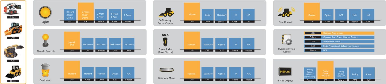
Competition Research (Feature Comparison)
Generation 1 — Immediate
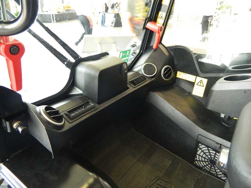
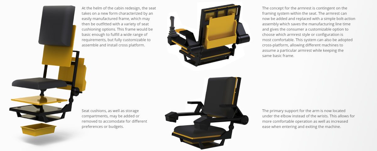
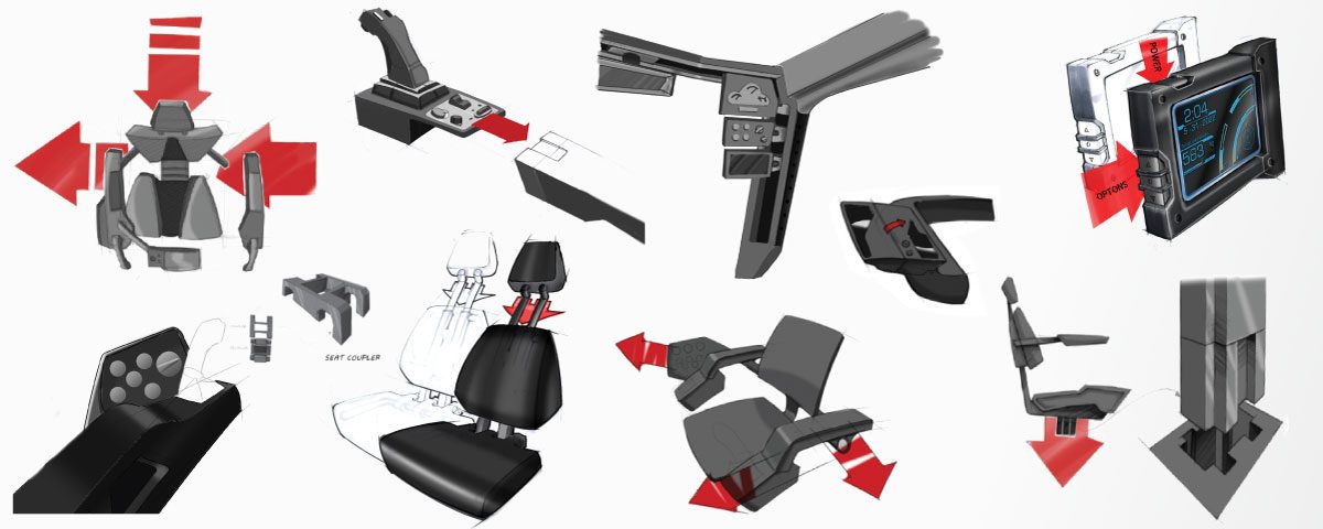
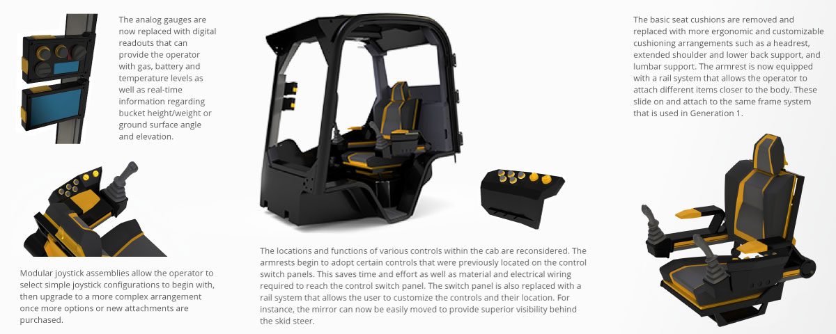
Generation 1 takes into consideration what can be moved, removed or redesigned to allow for a more affordable, streamlined design. This means addressing issues such as material choice, manufacturing methods and deciding how functions can be combined without detracting from the user's experience.
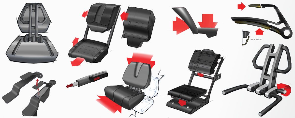
Ideation
Generation 1 Final Concept
Generation 2 — 3–5 Years
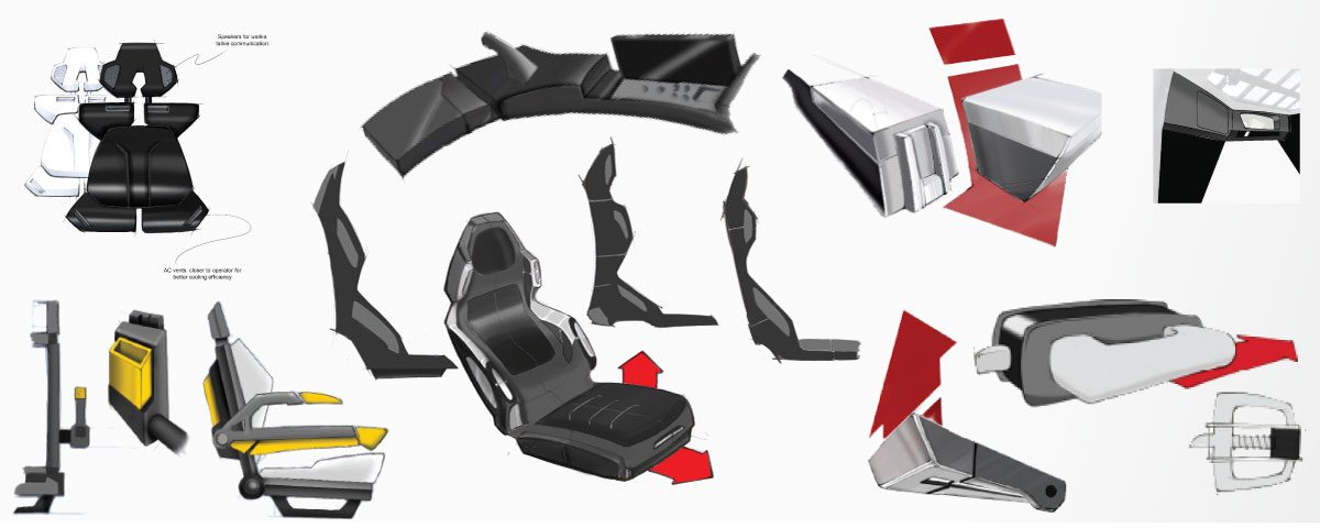
Generation 2 builds upon a modular framework that is the basis of generation 1. This begins with adding options within each zone to allow for a more customizable and personalized user experience. Because the framework will already exist from generation 1, these improvements can easily be made over the next 3–5 years.
Ideation
Generation 2 Final Concept
Generation 3 — 10+ Years
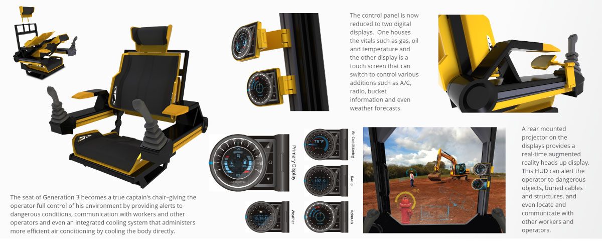
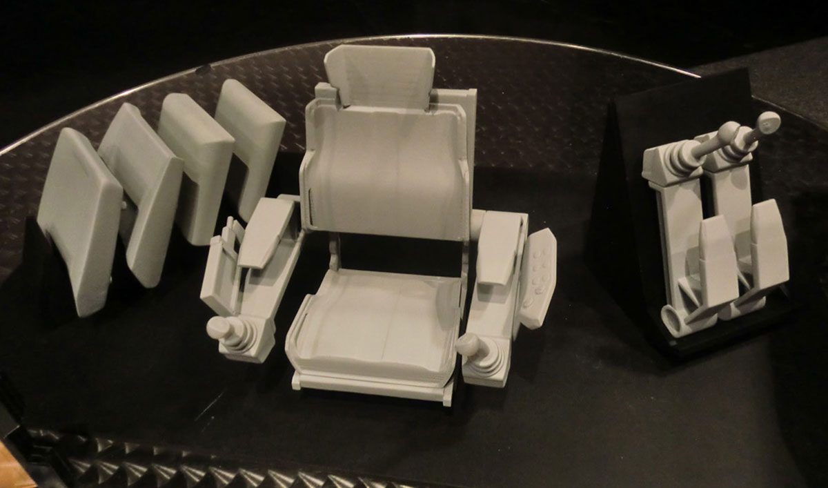
Generation 3 aims to incorporate future technologies that will exist in the next decade or already exist but will become more affordable and commonplace. These trends will eventually work their way into all parts of life, and keeping on the cutting-edge will allow JCB to remain on the forefront of modern machinery.
Ideation
Generation 3 Final Concept
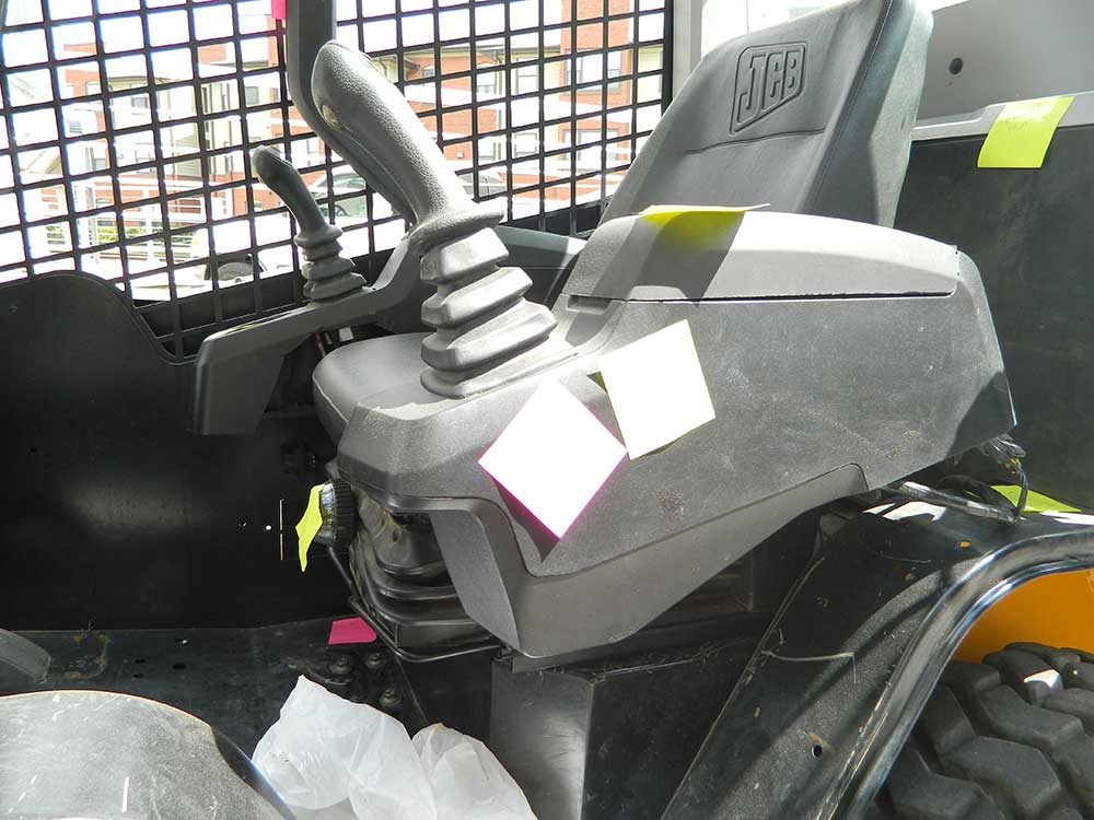
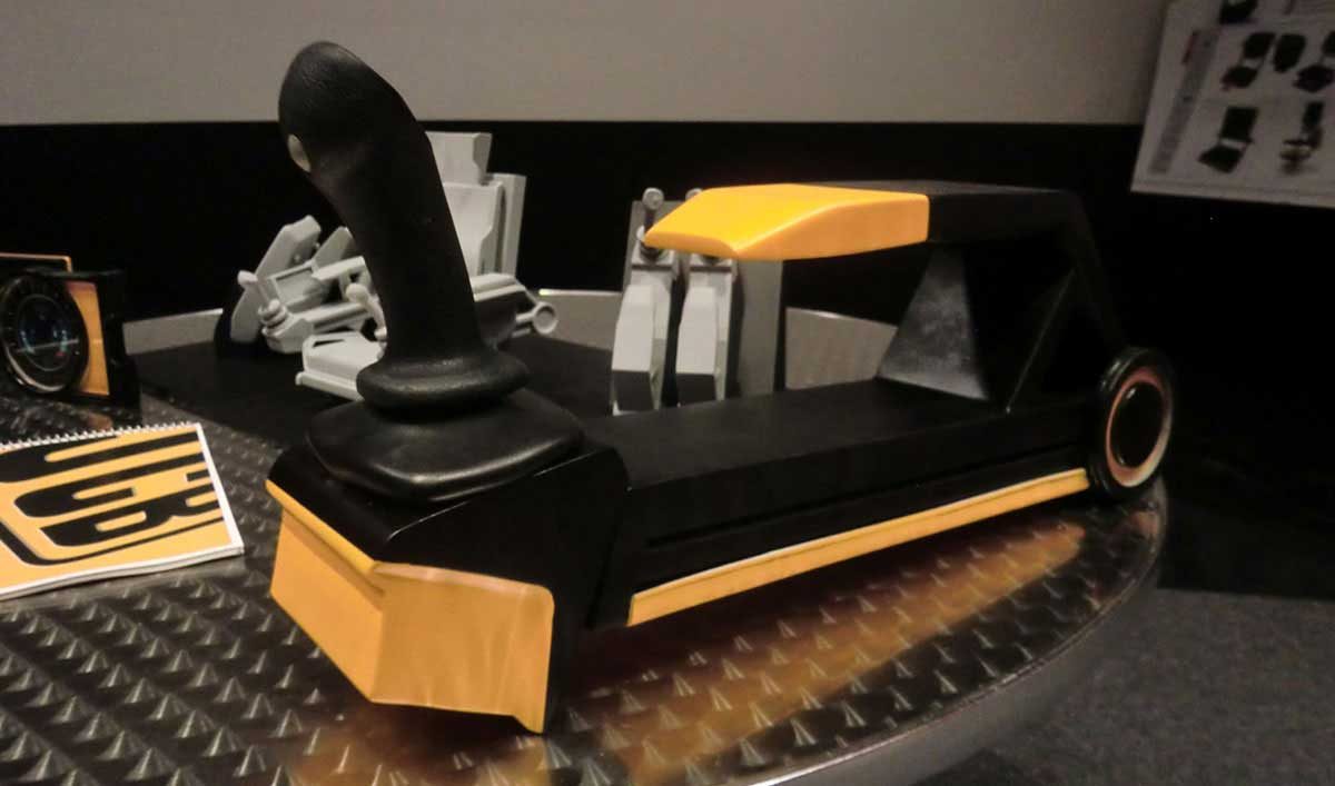
Armrest — Handmade (Wood Shop and Tools)
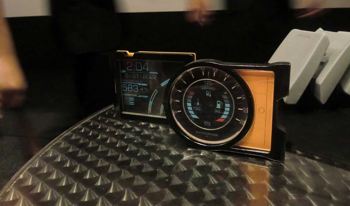
Control Panels — Laser Cut and Assembled
3rd Generation — 3D Printed
Pasta Making Tools for Kids (Ages 8–12)
The project focussed on analyzing design and technical problems faced by the pasta industry and kids who want to learn the art of pasta-making, establishing a design criteria to deal with those problems and generating appropriate solutions to those problems.
Our target demographic are children ages 8 to 12, this group is full of energy and curiosity. Between these years, kids are hungry for knowledge and they are willing to do activities that enhance their skills and intelligence.
Our goal is to innovate a product or process that would make the pasta-making experience a more fun, simple and safer activity for children.
Primary Research
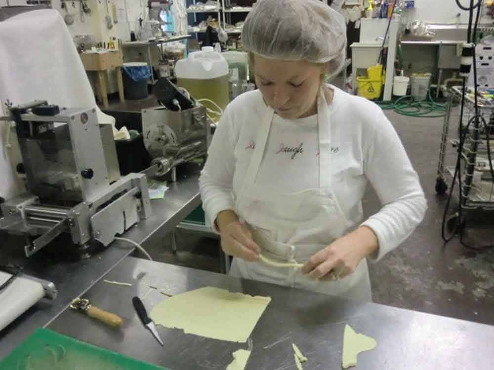
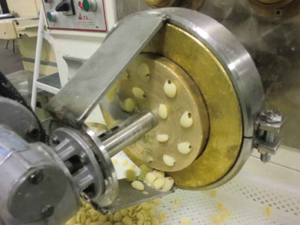
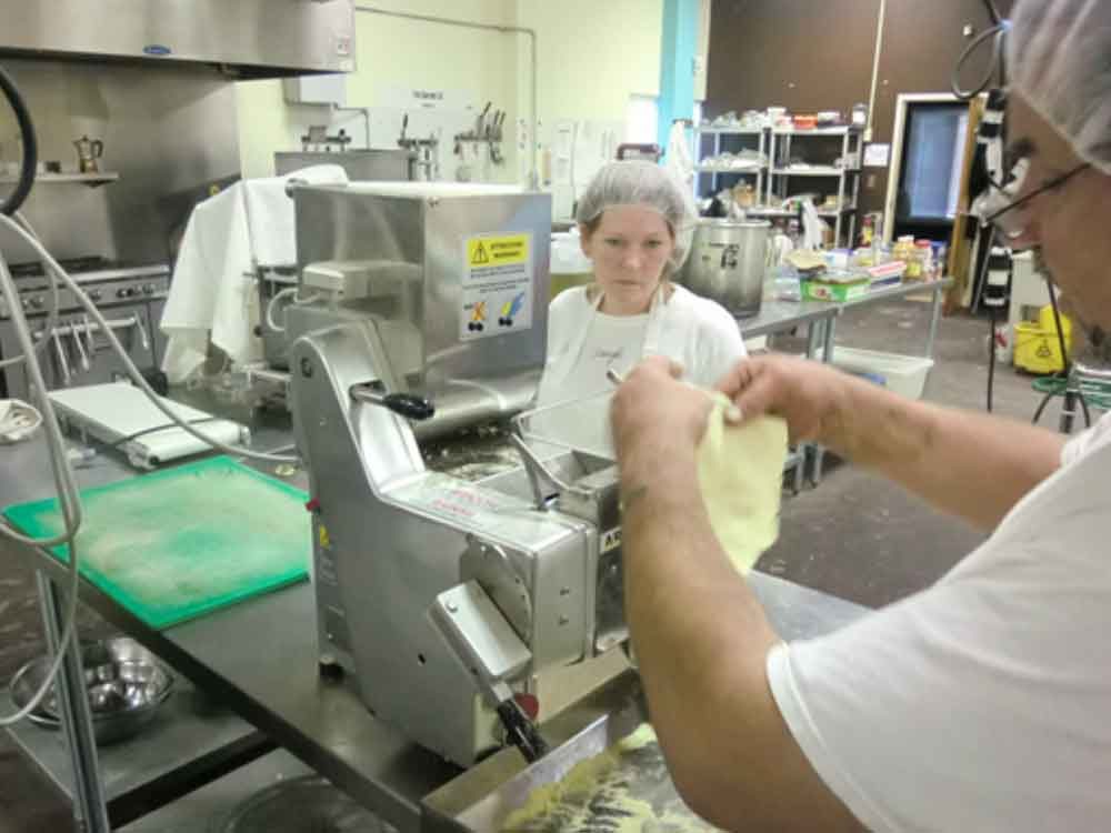
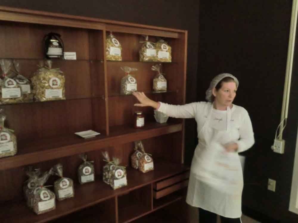
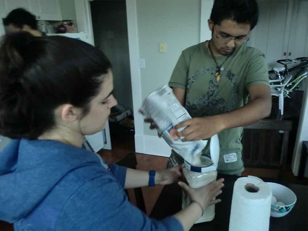
Nothing beats first-hand experience. The internet today may be an all-knowing, never-ending well of information but seeing and experiencing first-hand beats even the greatest of virtual-realities. Thus, we as a group decided that in order to gain a firm grasp of the pasta world, we had no choice but to dive-in (figuratively). We made certain that the places we visited covered all bases of pasta-making. We even glanced into the manufacturing and packaging processes in brief, thereby leaving no stone unturned. What we learnt from these various experiences gave us new and innovative insights into the ideation processes and eventually our final concepts.
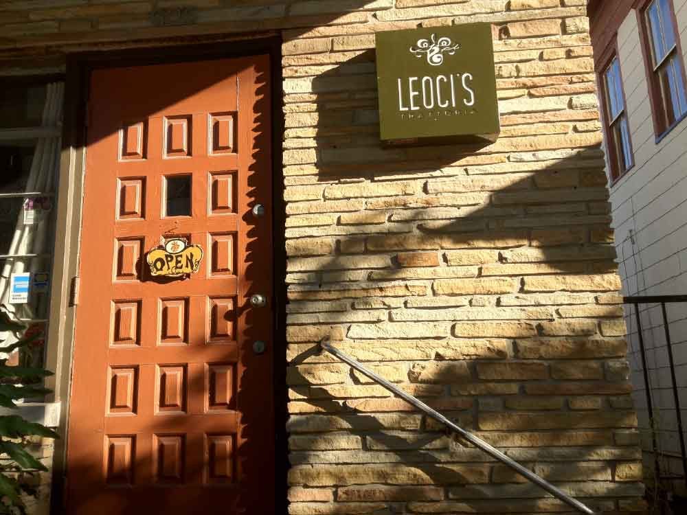
Leoci's Trattoria — Italian fine dining restaurant specializing in Gourmet Pasta dishes
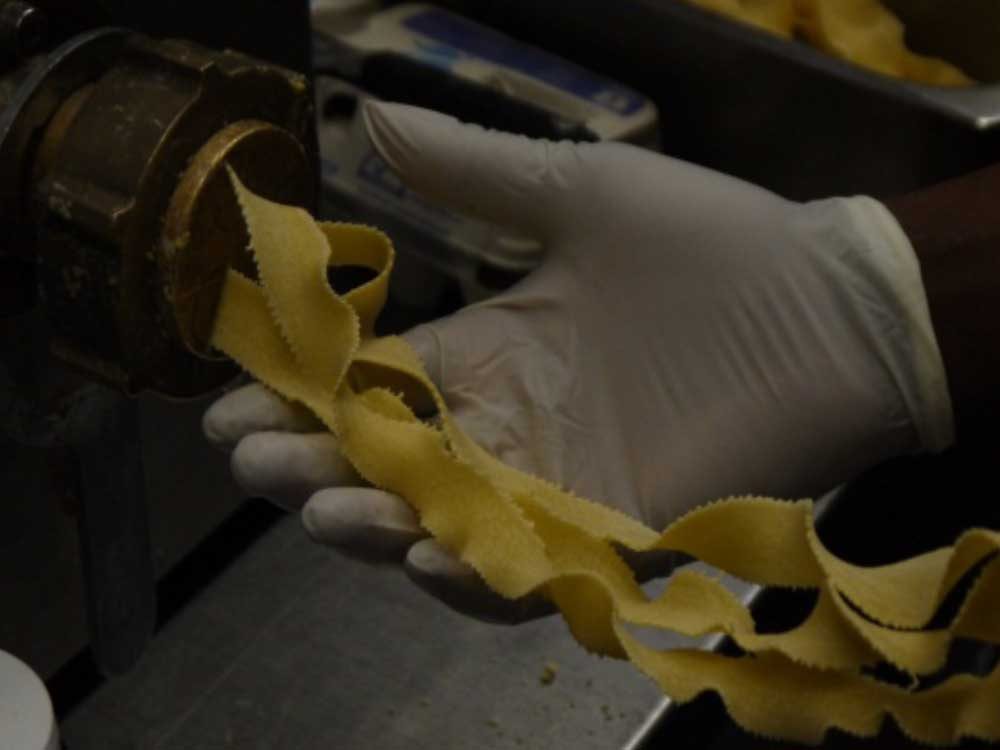
Frali Gourmet — Family owned all-natural pasta production plant specializing in healthy, organic and flavored pastas and sauces
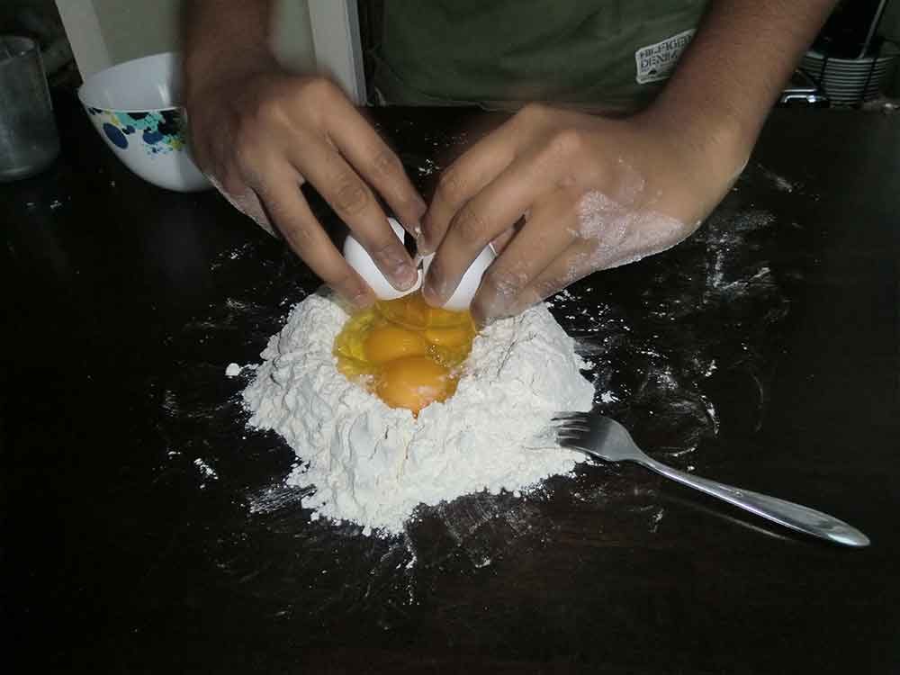
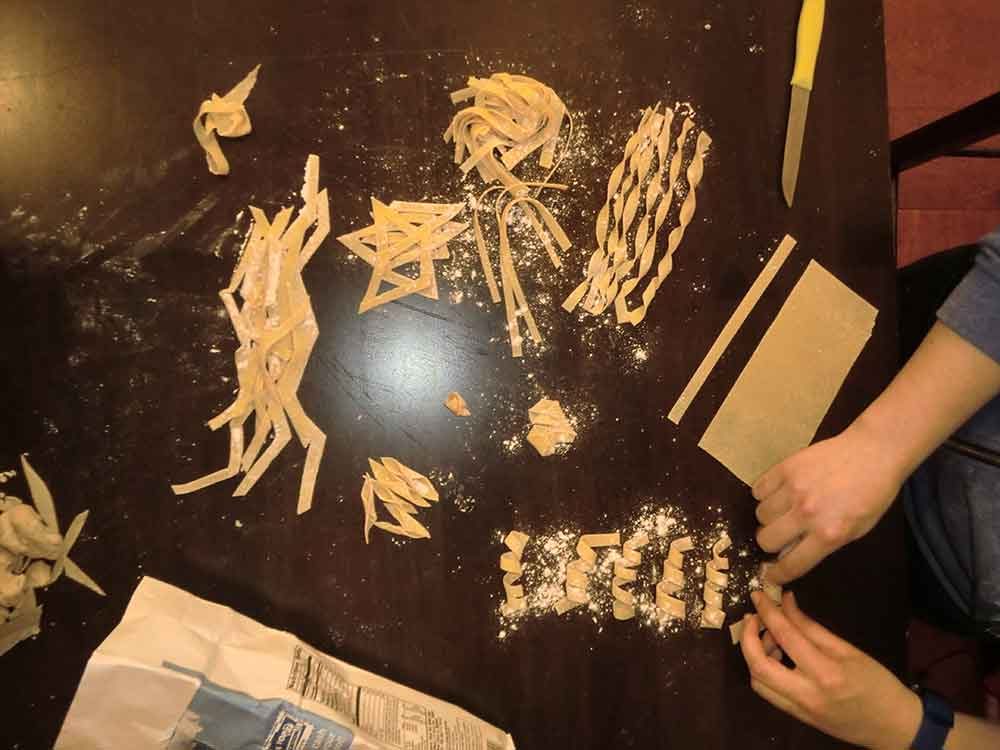
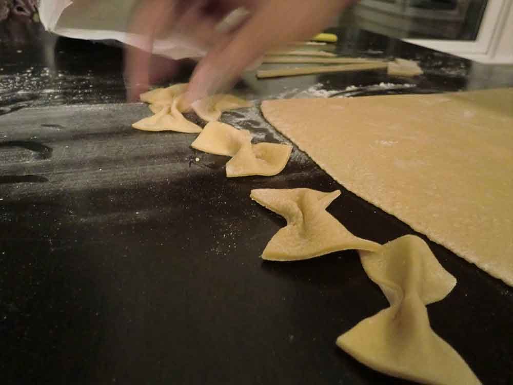
DIY Pasta — Making Pasta at home (from scratch)
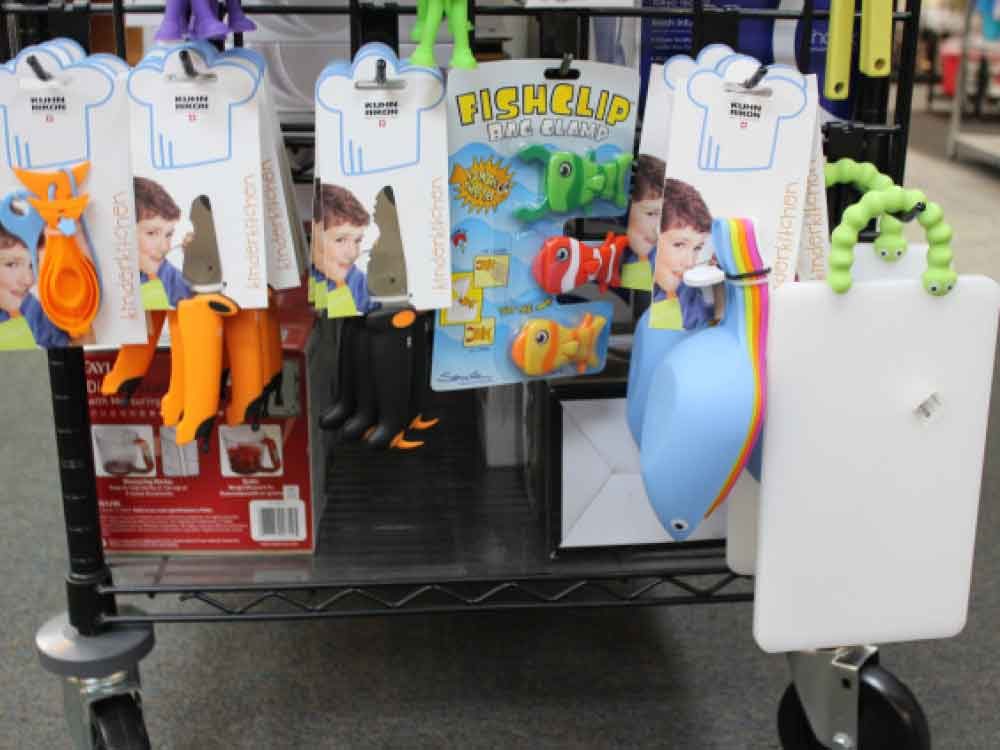
Market and Precedence Research
The Elements of Pasta Making
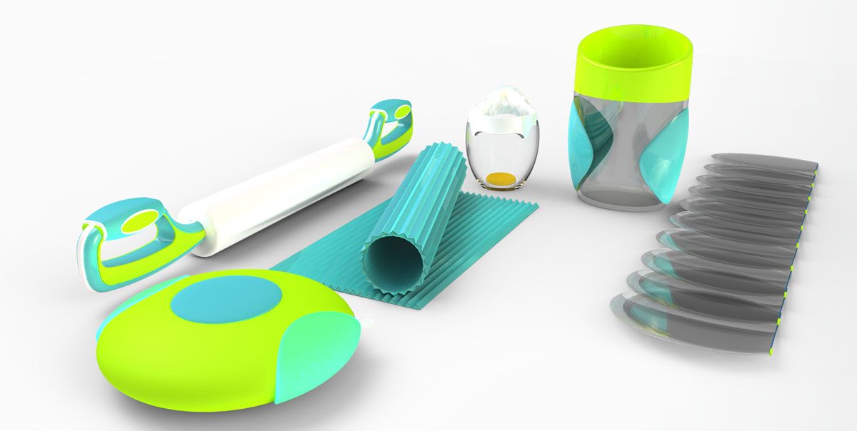
Concept Rendering
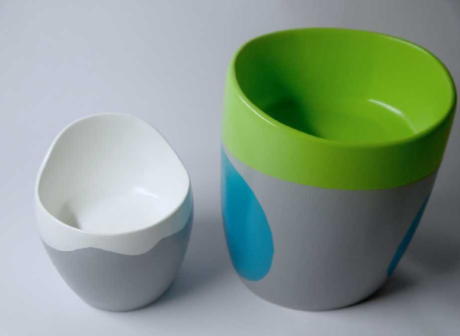
Measuring Cups
The measuring cups are the first tools we use in the process. The kids use them to measure the right amounts of flour and eggs that go into making the most consistent dough. These are designed according to the ingredients they hold. The egg cup holds up to three eggs, and the flour cup holds three cups of flour. The kids should fill the cup of flour until the green line.
Roller and Cutter
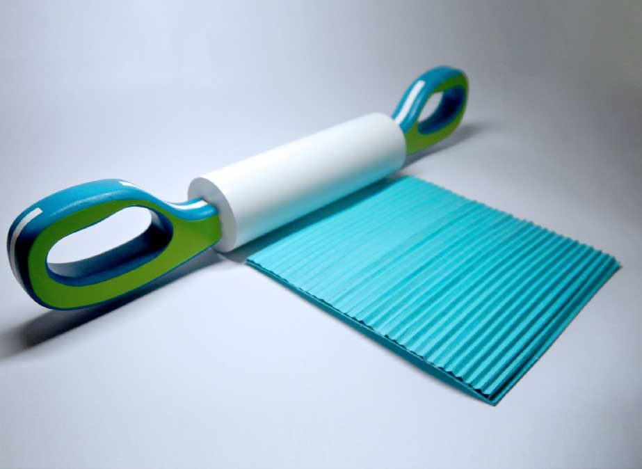
The roller is a two-piece product. Individually it is created for the sole-purpose of rolling out the dough into thin sheets that could then be cut into various shapes. In collaboration with the cutter however, the roller not only rolls out the dough, but cuts them into narrow strips that could be shortened or just directly boiled.
Disposable Zip-locs and Mixing Bag
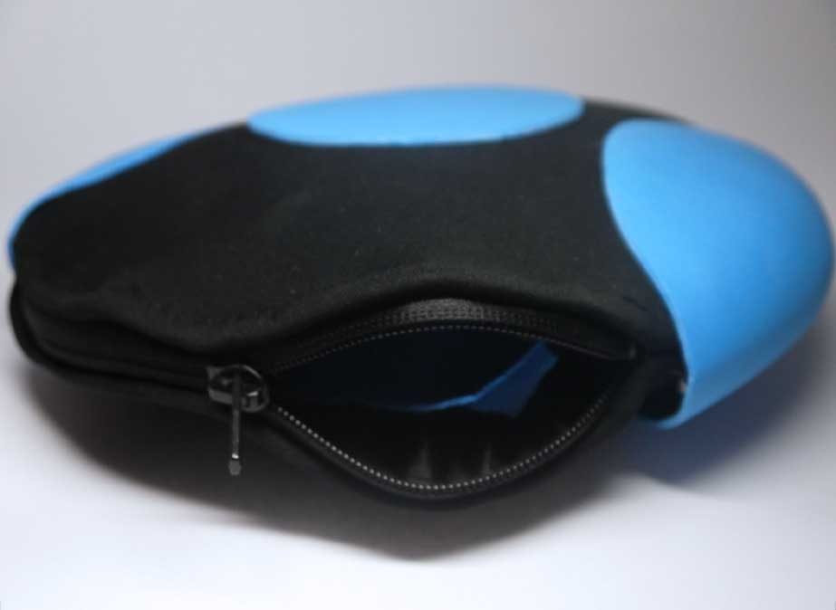
Sequentially the next product used in the pasta-making process are the zip-loc and mixing bags. The dough that we make using the cups is enclosed in the zip-loc to retain its texture and freshness. The mixing bag is specially designed to mix the dough. The material we used in the product helps preventing damage to the zip-loc bag which would otherwise be prone to tear due to the concentrated surface pressure caused by our hands. The bag is designed to be playful, durable and stain-resistant.
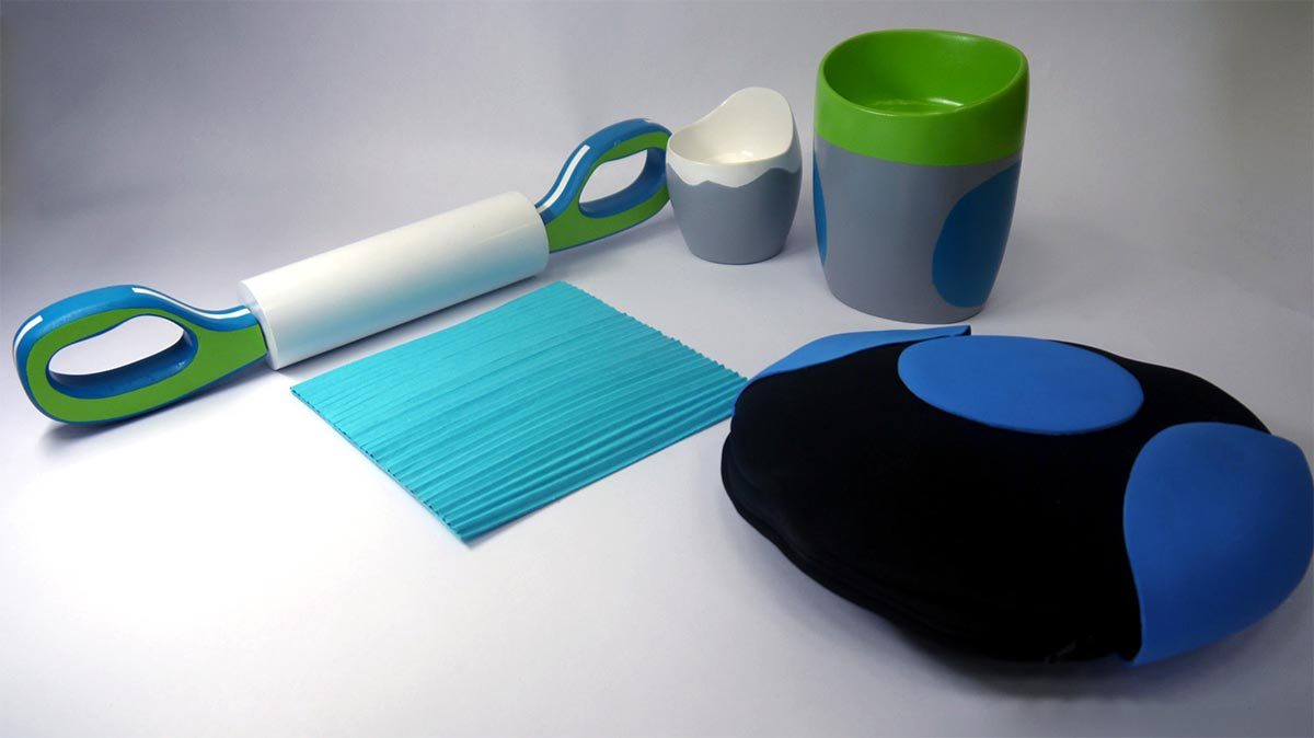
Aesthetic Prototypes
Materials used in construction — Yellow foam resin, spray paint and primer, paper, fabric (for mixing bag), thread, zipper
Tools used in construction — Hand Dremel, sandpaper, lathe, artist tape
Measuring Cups — Polyethylene Terephthalate, Polystyrene, Silicone Grips.
Roller and Cutter — Polystyrene roller, handle and cutter, Metal Rod and nuts for assembly.
Disposable Zip-locs and Mixing Bag — Neoprene bag, Silicone Grips and Zipper, Vinyl PVC Ziplock.
Developed and Completed in 2013
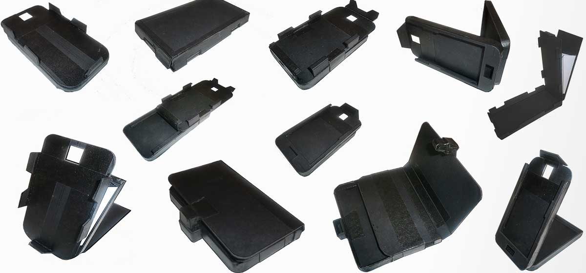
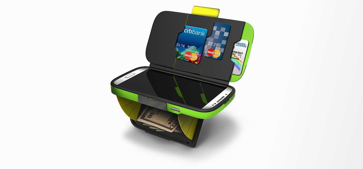
Designed during the transition from physical to digital payments, the eWallet bridges cash, cards, and NFC contactless payments in a single ergonomic device — complete with fingerprint reader security.

According to data from Ernst & Young, mobile payments are expected to be big business, with the market reaching a massive $245 billion by 2014, up from $16 billion in 2010. The shift is coming rapidly, as payment methods are moving away from credit cards, debit cards and cash to smartphones, tablets and other mobile devices. Inevitably, there will be a phase in between when wireless payment forms (NFC and RFID) will be used concurrently with cash and plastic. The e-wallet is the device that would thrive during that phase.

Rapid Prototyping
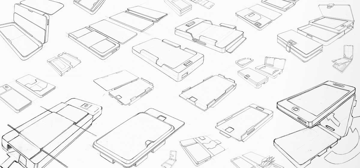
Sketch Modelling
Your credit cards: gone. Bus pass and train tickets: vanished. Those dog-eared loyalty cards for high street coffee shops: binned. You've been the victim not of theft, but of the future — a future where the wallet, purse, paper ticket and pocket have all gone digital and live solely on your phone. Welcome to Near Field Communications (NFC), a contact-less, Wi-Fi-lite style tech that could already be in your smartphone, and could soon be a regular feature of your commute.

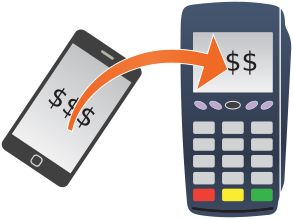
NFC allows for data exchange between two devices (e.g. a smart phone and a payment device) through physical contact.
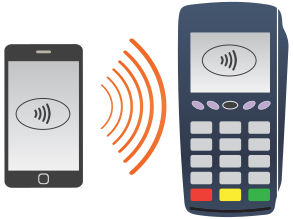
The initiator device (the mobile phone) generates a radio frequency field that transmits the data within a range of 4 centimeters.
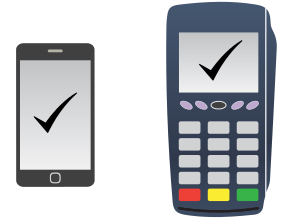
The target device (the payment device) picks up the RF field and receives the data it contains.
At its core, all NFC is doing is identifying us, and our bank account, to a computer. The technology is simple. It's a short-range, low power wireless link that can transfer small amounts of data between two devices held a few centimeters from each other. Unlike Bluetooth, no pairing code is needed, and because it's very low power, no battery in the device is being read. By tapping your phone on a contactless payment terminal in a shop, train station or coffee shop, the NFC receiver is able to identify your account (and even your personal preferences, shopping habits and even your most frequently traveled route home) and takes payment through an app on your phone.
Storing Cash
Reading cards
Fingerprint Reader for security
NFC capability for express checkouts
A Collaboration on Wearable Technology
Providing crossfit athletes with real-time body data for recovery and injury prevention — through a compression suit embedded with Climaware Tech, muscle contraction sensors, and adjustable compression dials.
To provide crossfit athletes with an avenue to receive information about their body, its needs for recovery and injury prevention, and help them improve their overall health and performance.
Climaware Tech used at the wrists. When soaked, skin temperatures lower by 10–15 °F
Muscle Contraction sensors used to record muscle performance and recovery
Dial at the ankles and wrists to adjust compression percentage for custom recovery
Inspired Toy Design
Designing a weapon from the 2010 Avatar film, adapted as a toy without compromising the movie's design language or aesthetics. The challenge: maintain the visual identity of an alien world for a child's product.
The objective of this project is to design a weapon for the 2010 blockbuster movie — Avatar, by adopting the style and design language used in the movie. The weapon must be modified to be manufactured as a toy without compromising its design language or the aesthetics of the movie. The target demographic of the toy will be children between the ages of 8–14.
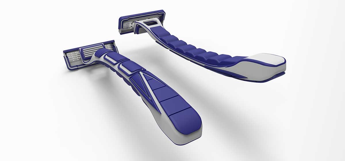
Shaving Blade Design Concept
A shaving blade concept combining style and ergonomics — part plastic, part rubber grip — into one sleek and cost-efficient product. Designed to be visually distinct without sacrificing function.
This Razr shaving blade concept aims to combine style and ergonomics into one sleek and cost efficient shaving blade. The razor is part plastic (white) and part rubber (blue). The rubber was added to provide a comfortable grip for the user to hold on to.
Soccer Cleat Concept
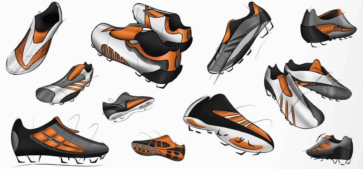
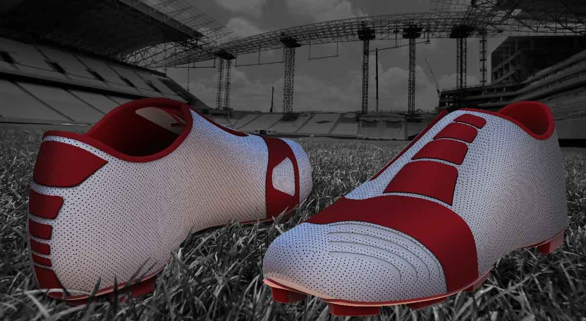
A personal passion project — a soccer cleat that leans into the clean, elegant aesthetics of the late 80s and early 90s, when class and comfort were as important as speed.
Being a soccer fan, it was only a matter of time until I attempted this. I personally have always been partial to the more clean looking cleats, reminiscent of the late 80's and early 90's when soccer cleats were being marketed more towards the gentleman athlete. When it was more important to convey class and comfort rather than speed and aggression. Not that there's anything wrong with that.
Aesthetic Design Concept
An automotive aesthetic design concept — exploring form, proportion, and line from ideation sketches through to finished renders.